Ford Design System
 The Ford Design System (FDS) — internally "Project Edison" — is Ford Motor Company's first-ever universal Design System. A unified visual design language, elements, components, and patterns governing every consumer-facing Ford digital experience across Web, App, and In-Vehicle. Built by VMLY&R teams in the U.S. and South Africa in partnership with Ford. In active use today across North America, South America, China, and Europe.
Ford Owner Web Case Study ➝
The Ford Design System (FDS) — internally "Project Edison" — is Ford Motor Company's first-ever universal Design System. A unified visual design language, elements, components, and patterns governing every consumer-facing Ford digital experience across Web, App, and In-Vehicle. Built by VMLY&R teams in the U.S. and South Africa in partnership with Ford. In active use today across North America, South America, China, and Europe.
Ford Owner Web Case Study ➝
Contributing Designer
(Owner Web Lead)
(Owner Web Lead)
Primary Workstream
Owner Web
(AEM 6.1 → 6.4)
(AEM 6.1 → 6.4)
FDS Role
Contributing Designer
Owner Web Lead
Owner Web Lead
Design Team
5-6 Dedicated
3-4 Contributors
3-4 Contributors
Duration
Began 2019
Ongoing
Ongoing
Agency Title
Senior Art Director / UI Design Lead — VMLY&R (WPP)
Client Role
North American Design Lead — Ford Owner Web
Contribution
The migration schedule gave me production runway that other contributors didn't have. I was shipping — building, testing, and validating components against real constraints on a production calendar. That efficiency meant more of my foundational work was production-proven and ready for system adoption by the time the FDS team was evaluating contributions.
Collaboration
Cross-functional alignment with the FDS team, implementation partners, and Stakeholders to ensure components built for the migration met emerging system standards and could scale beyond the web surface.
VMLY&R's Mandate From Ford
Ford hired VMLY&R to solve a problem that had been compounding for two decades. Ford's digital ecosystem had grown organically across a 190,000+ person organization — sprawling across regions, brands, product lines, and surfaces. Every region built its own digital experiences. Every Product Team shipped its own component patterns. Every vehicle platform spoke a different UI language. Customers experienced Ford differently depending on where they entered the ecosystem. The mandate was clear: build Ford's first-ever universal Design System — one unified visual language that governs every digital Ford experience, globally.
Before FDS
Fragmented regional stacks (NA, SA, China, Europe) each maintaining their own component sets, style guides, and authoring logic. Ford and Lincoln diverging despite sharing the same authoring platform. Web, App, and In-Vehicle speaking different visual languages. No shared component library. No central governance. No code-design parity. Duplicate work, inconsistent brand expression, compounding support load, slow time-to-market. Every sprint pushed the experiences further apart.
After FDS
One universal visual design language. One component library. One GitHub code kit for development. One governance model. One authoring standard. Shared elements, components, and patterns for all digital Ford experiences — Web, App, In-Vehicle. Design and engineering aligned on the same source of truth. Global rollout: NA, SA, China, Europe. Scalable across Ford and Lincoln brands. Accessible by default. And critically — still in active use today, continuing to evolve as Ford's digital ecosystem expands.
The Core Problem
Ford was operating as a federation of digital experiences, not a unified brand ecosystem. Customers encountering Ford through Owner Web in the U.S. got a different visual language than customers using the FordPass app, than customers sitting in a Lincoln dashboard, than customers visiting Ford.com in China. The brand was ONE brand. The experience wasn't.
Why Now
Connected vehicles had turned cars into digital ecosystems. FordPass was scaling globally. Owner Web was undergoing an AEM 6.1 → 6.4 modernization. EV launches required new digital onboarding flows. Every new product demanded bespoke design and dev work because nothing was shared. The cost curve wasn't sustainable — a Design System wasn't a nice-to-have, it was infrastructure.
What VML&R Was Asked to Build
Ford Motor Company's first-ever universal Design System. Elements, components, and patterns for every digital Ford experience. A GitHub code kit so engineering consumed the same source of truth as design. Documentation. Governance. Internationalization support for global markets. Accessibility embedded from day one. Partnership across U.S. and South Africa teams, working directly with Ford UI/UX, dev leads, PMs, and Creatives.
Project Edison — The FDS Team Structure
Internally known as Project Edison, the Ford Design System (FDS) was its own workstream with a dedicated build team. VMLY&R ran teams in both the U.S. and South Africa, collaborating directly with Ford UI/UX Designers, Technical Development Leads, Program Managers, and Creatives. The system was designed to be consumed by every Ford digital Product Team worldwide — which meant the contributing perspective had to come from those Product Teams themselves.
Dedicated Core
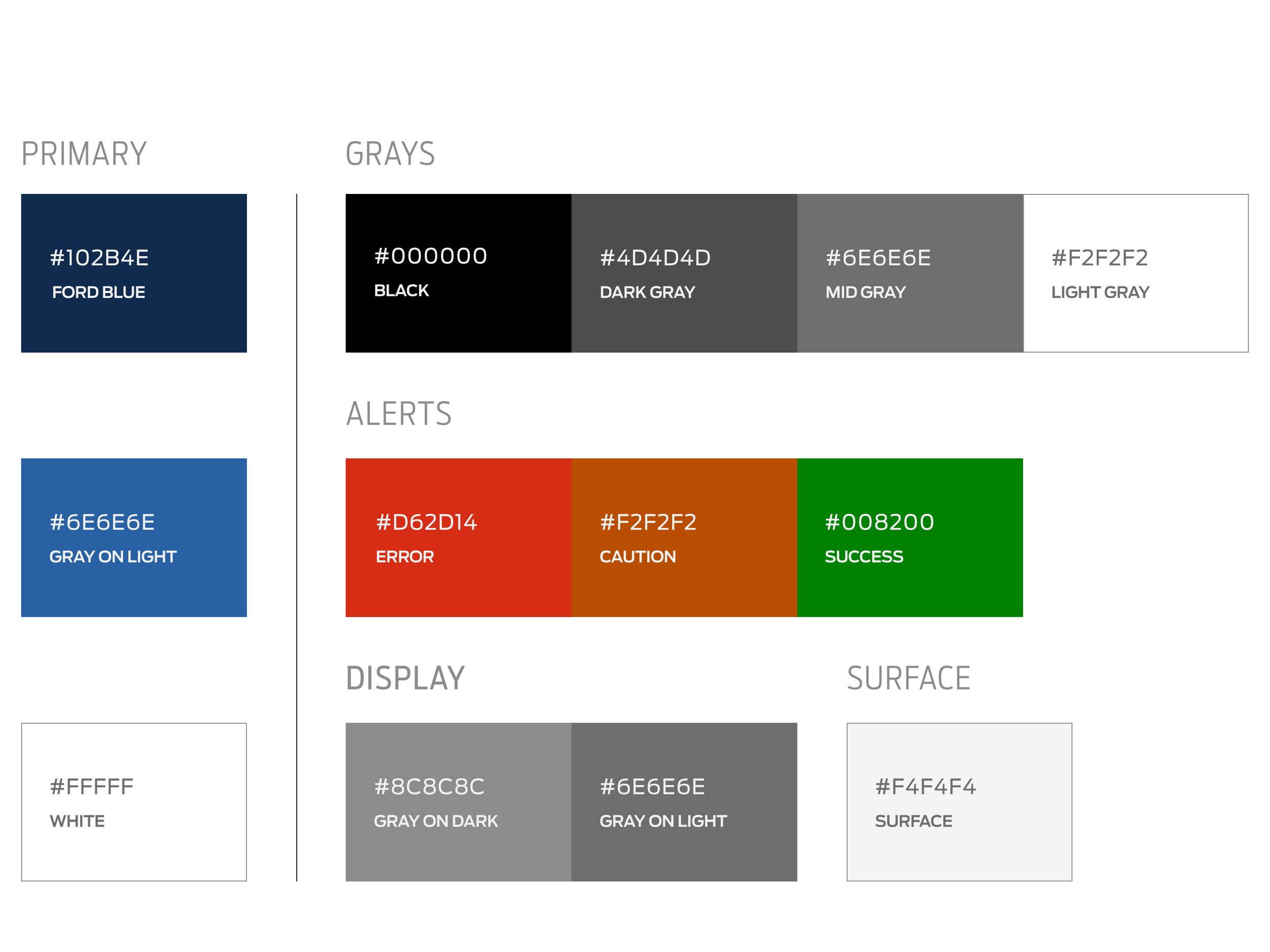
5–6 dedicated Designers building the system full-time. They owned the foundations — type scale, color tokens, spacing systems, atomic design primitives, documentation, governance model, and the GitHub code kit that paired design tokens to engineering implementation.
Product Contributors
3–4 contributing Designers feeding the system from the product workstreams — one from Web, one from App, one from In-Vehicle. Our job was to stress-test emerging standards against the real constraints of our surfaces and contribute production-proven patterns back into the system. I was the contributing Designer representing Web.
Cross-Continental Build
VMLY&R ran parallel teams across the U.S. and South Africa, working in sync with Ford's internal design org. Internationalization wasn't a feature added later — it was structural to how the system was built, because the team building it was already distributed across continents.
My Leverage
I was simultaneously running the Owner Web AEM 6.1 → 6.4 migration — a production calendar, not a research calendar. That meant the components I built had to ship. They got stress-tested in real market conditions across NA and Europe. When those migration-grade components met FDS standards, they became some of the earliest validated production inputs into the system. Production runway converted into system contribution.
Cross-Workstream Collaboration
I worked closely with FordPass App Designers, Mach-E / BEV UI/UX Designers, and Web Designers across Western Markets to cross-analyze how components needed to behave at production scale across In-Vehicle, App, and Web contexts. The contributor model existed because those constraints could only be surfaced by Designers embedded in product workstreams shipping real work — not from a centralized system team working in isolation from the surfaces their components would govern.
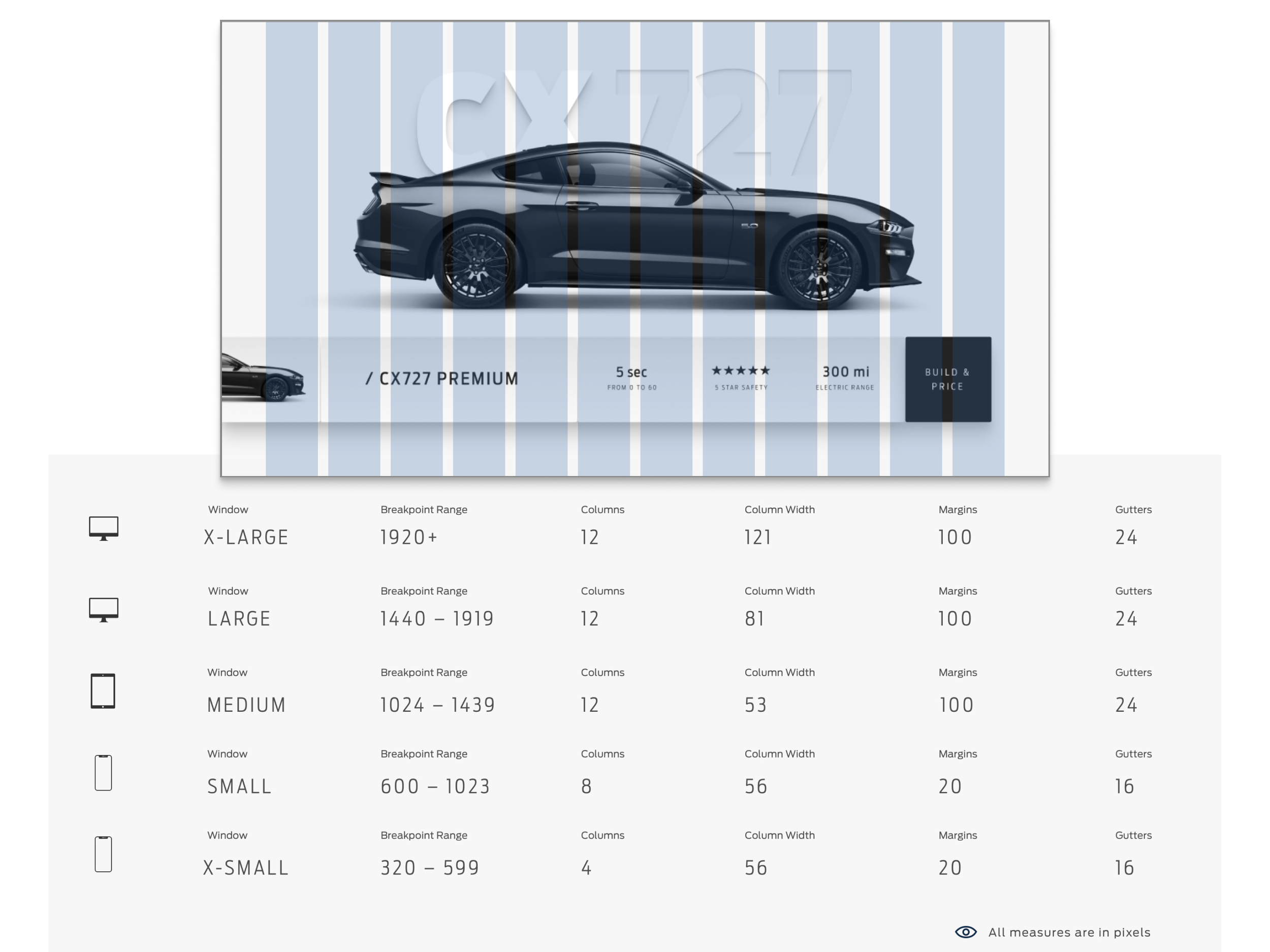
The System Architecture
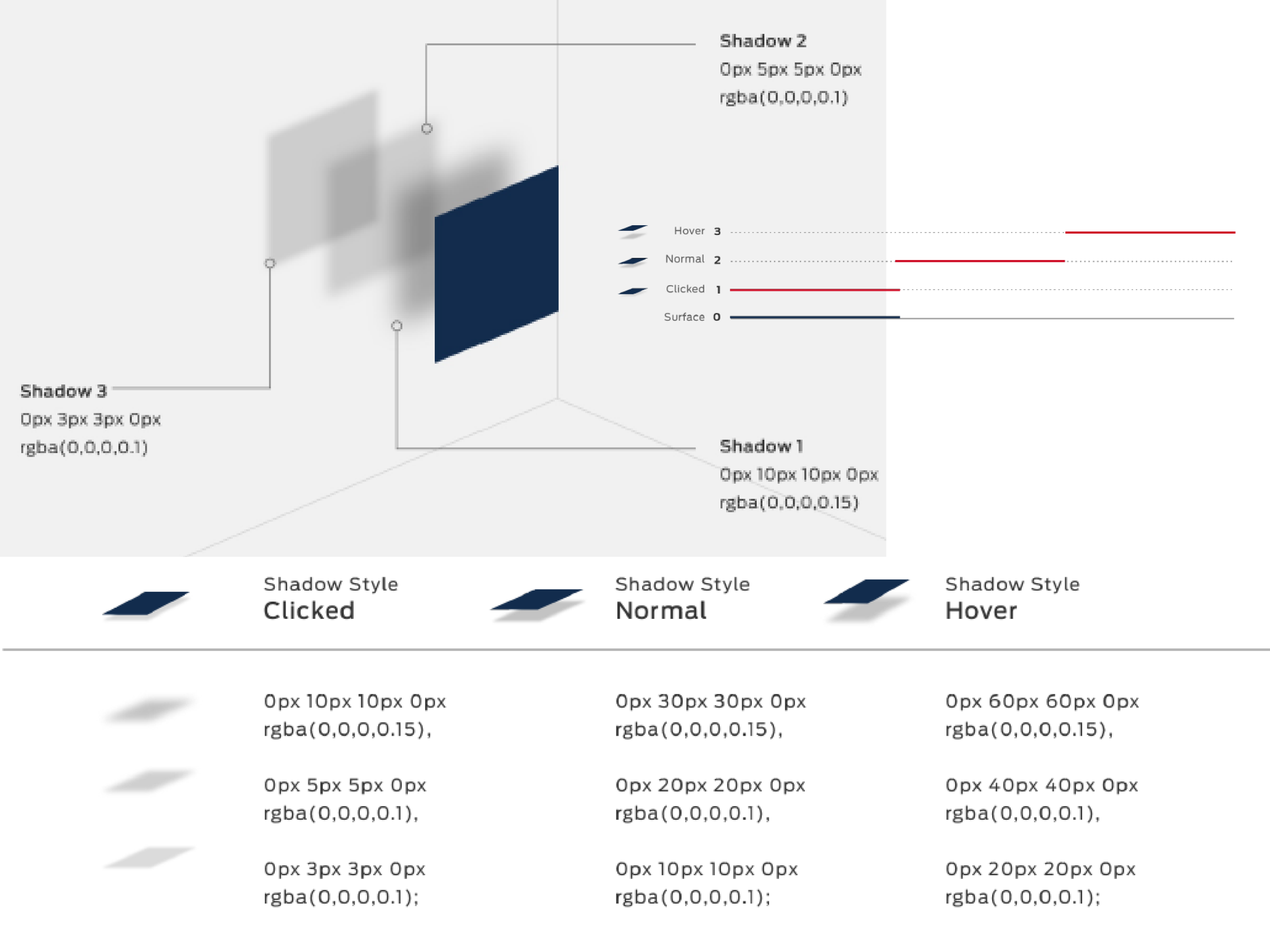
Project Edison was built on atomic design methodology — but what made it a universal system was the structural rigor behind the pretty surface. Three pillars held the entire system together.
A Design System isn't a library of pretty components. It's infrastructure. The FDS was built to scale Ford's digital brand across every surface, every region, every Product Team — and still be governable six years later.
01
Atomic Design
Foundations → Patterns
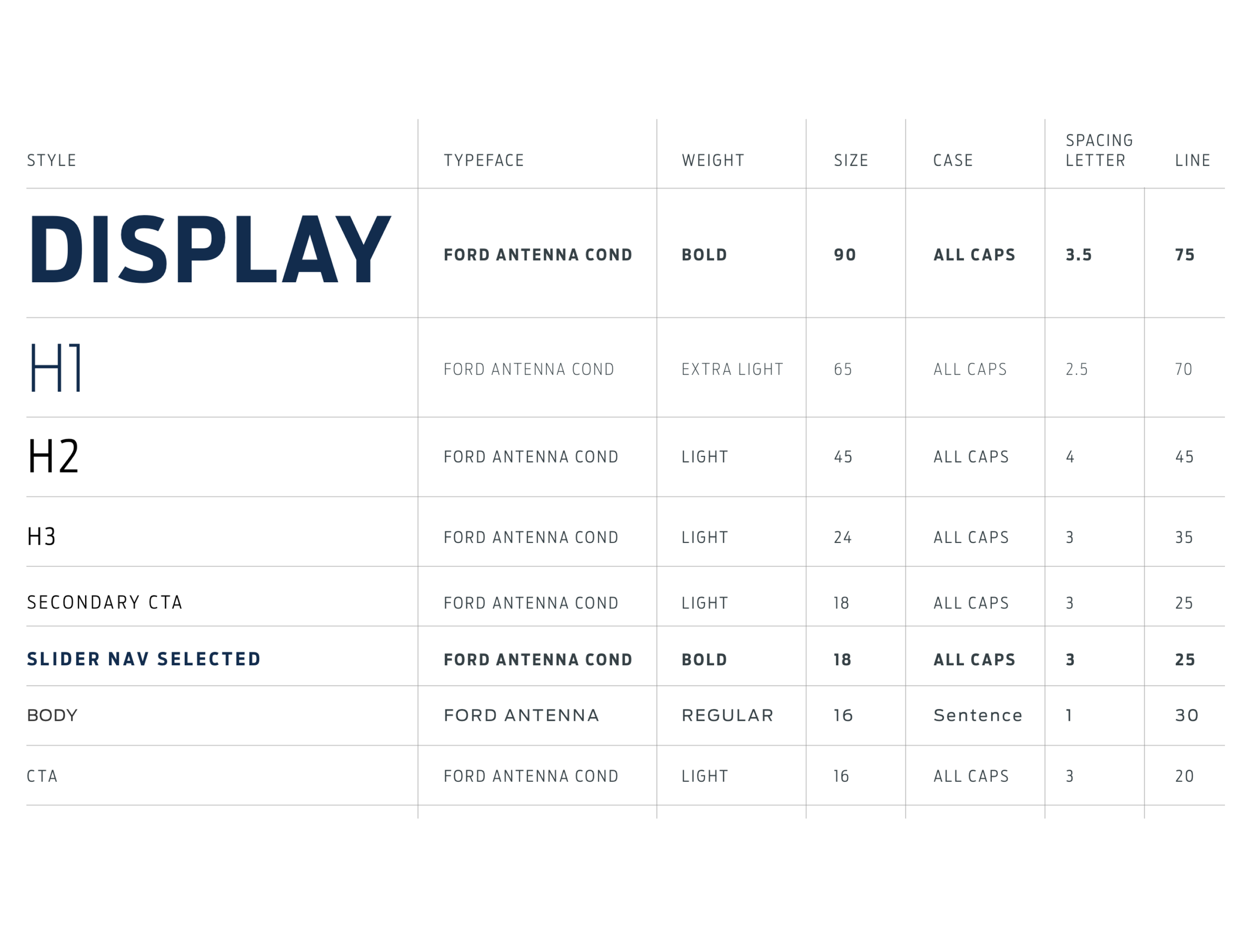
Built ground-up using atomic design principles. Tokens at the foundation — color, typography, spacing, elevation. Atoms and molecules composed into components. Components composed into patterns. Patterns composed into full screens. Every level of the system references the level below it. No orphaned styling. No one-off components.
02
Design–Dev Parity
GitHub Code Kit
The system shipped with a GitHub code kit so engineering consumed the same source of truth as design. Token values, component specs, and interaction patterns were authored once, published to both Figma and code. Eliminated the design-to-dev translation gap that breaks most Design Systems at scale.
03
Internationalization
Global From Day One
Internationalization was structural, not retrofitted. Every pattern had to work across North America, South America, China, and Europe — different languages, different content density, different regional conventions, different regulatory requirements. The system was built for distributed consumption from the first line of code.
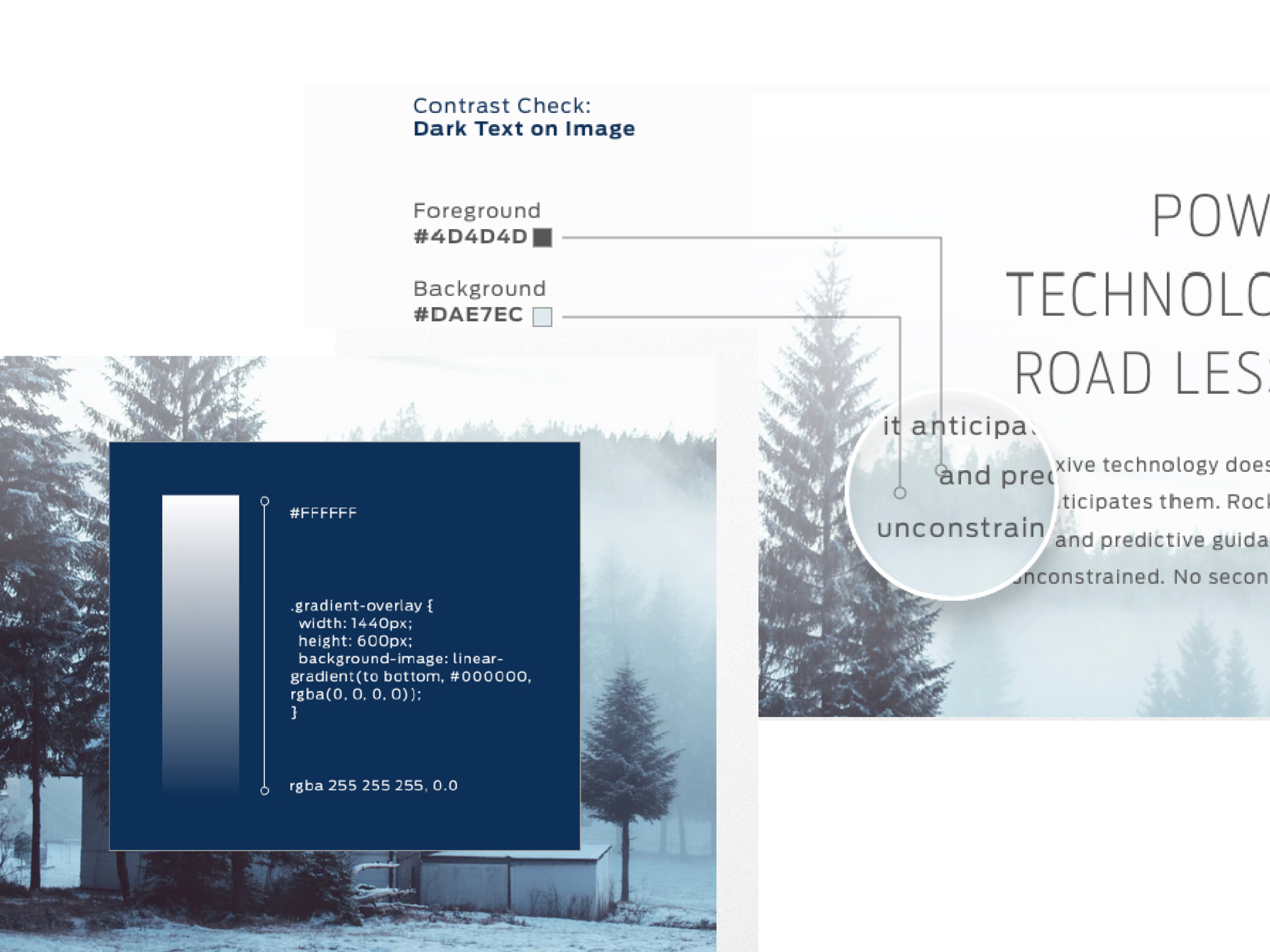
Accessibility Baked In
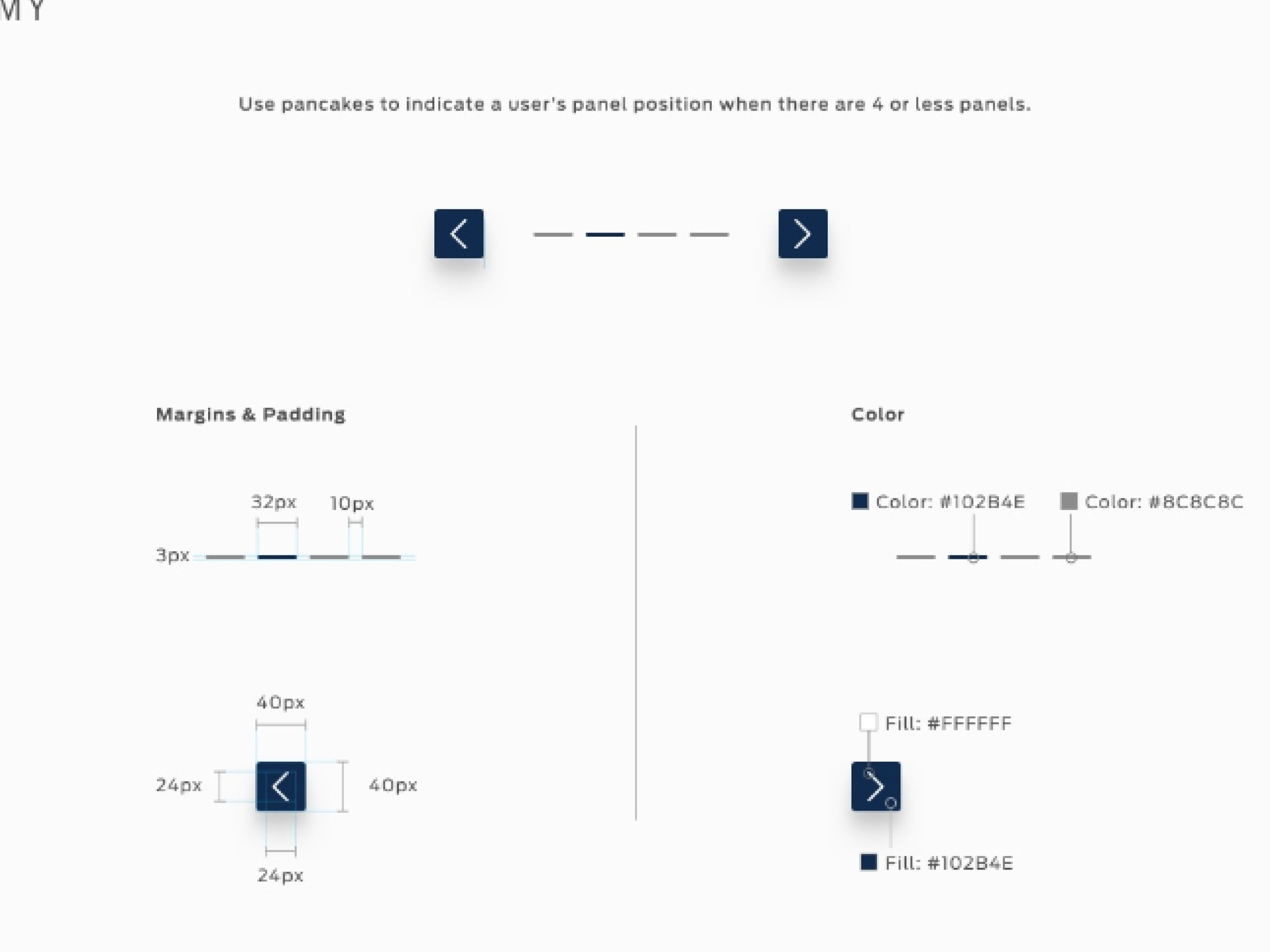
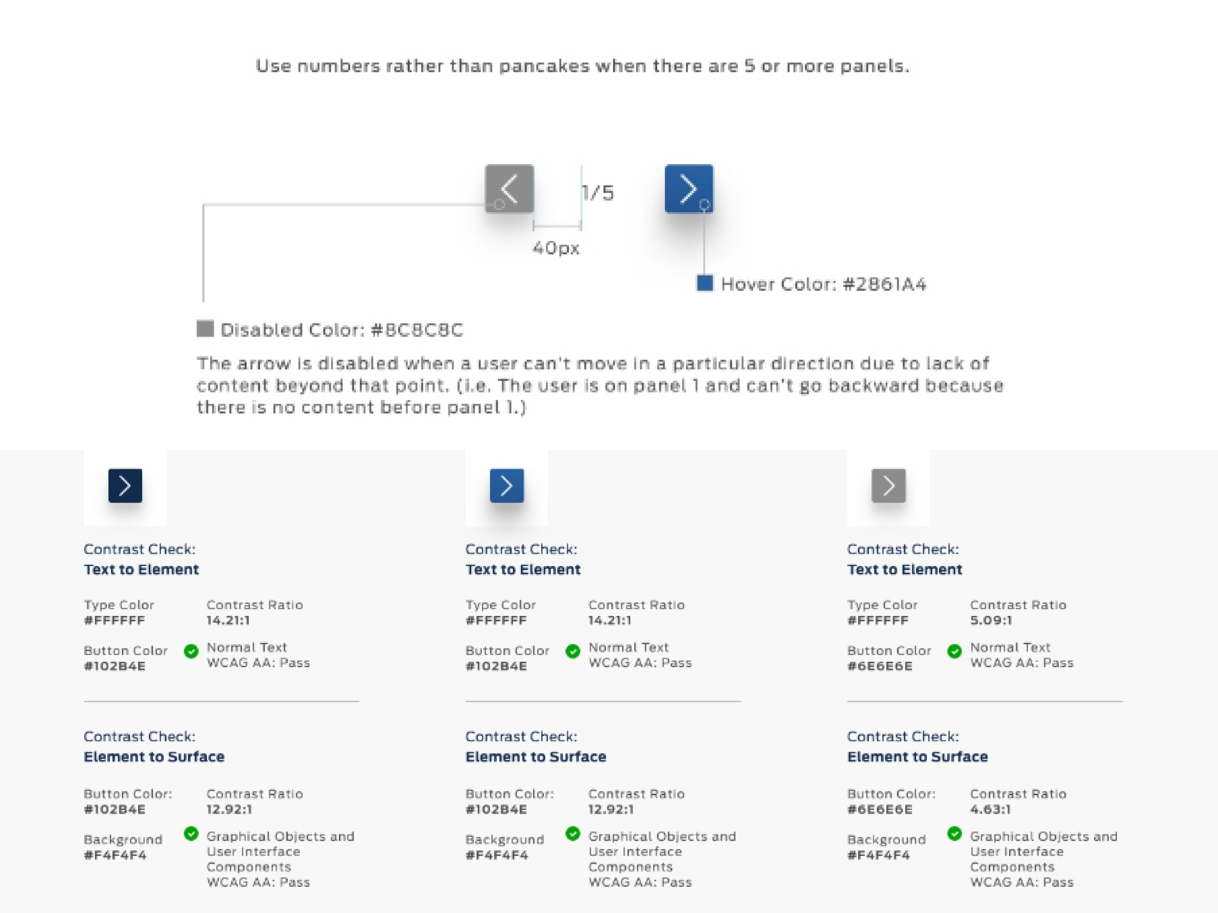
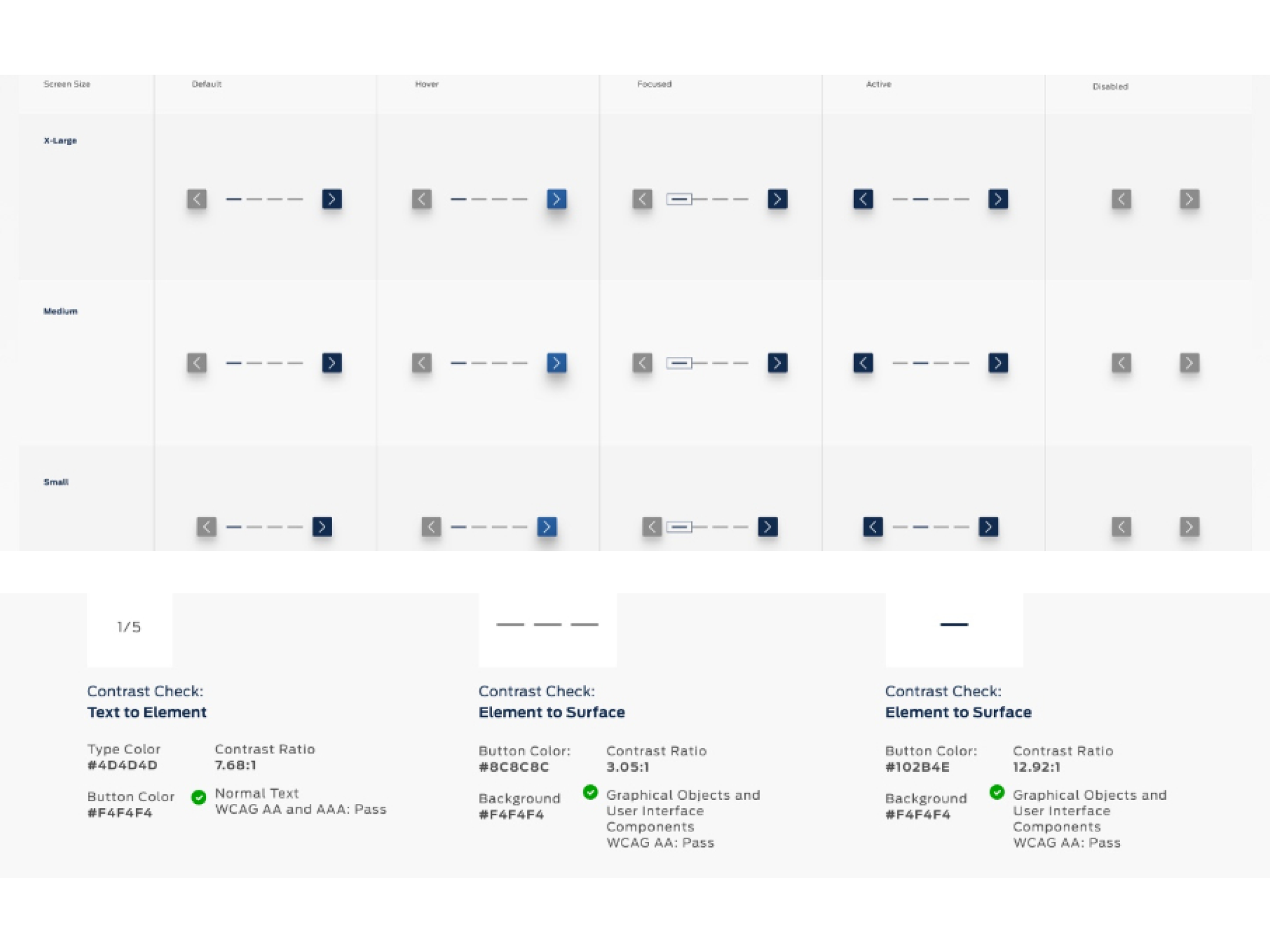
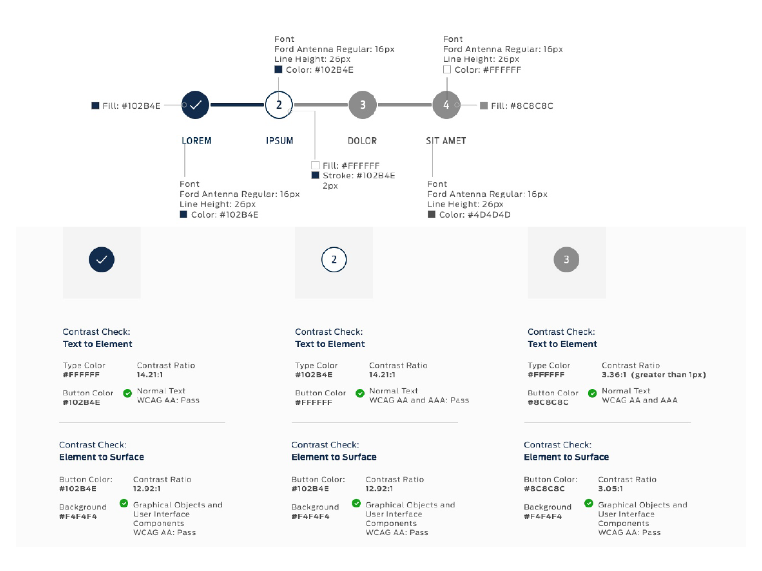
WCAG 2.1 compliance embedded at the component level — not bolted on at QA. Every element, component, and pattern shipped with accessibility validation. Product Teams consuming the system inherited accessible UI by default. No remediation sprints. No downstream debt.
Documentation + Governance
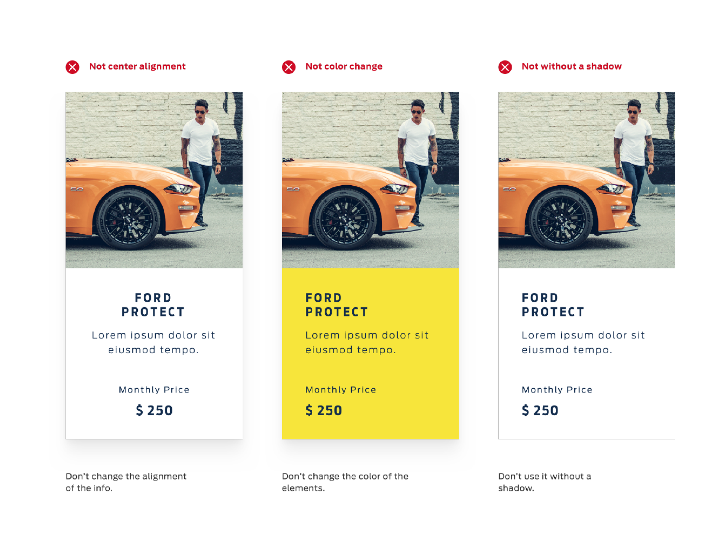
The system included usage documentation, decision trees, accessibility guidelines, and a governance model for how new contributions get evaluated and merged. A Design System without governance drifts. The FDS was built with governance as a first-class citizen from day one.
My Contribution Layer
From the Web workstream, I fed production-proven components — authenticated flows, form patterns, content modules, navigation structures — validated across NA and Europe. Component Architecture, Accessibility-First UI, WCAG 2.1 Validation, Cross-Team Alignment, AEM Authoring Constraints.
Production vs. Form
The dedicated FDS team was architecting foundations. The contributor layer was where real-world authoring constraints, cross-regional edge cases, and cross-surface behavior got pressure-tested. Components that looked great in isolation had to survive content authoring at scale, WCAG enforcement across three markets, and coherence from a 1080px desktop down to an in-cabin glance. That gap is why the contributor model existed — and why the work got adopted.
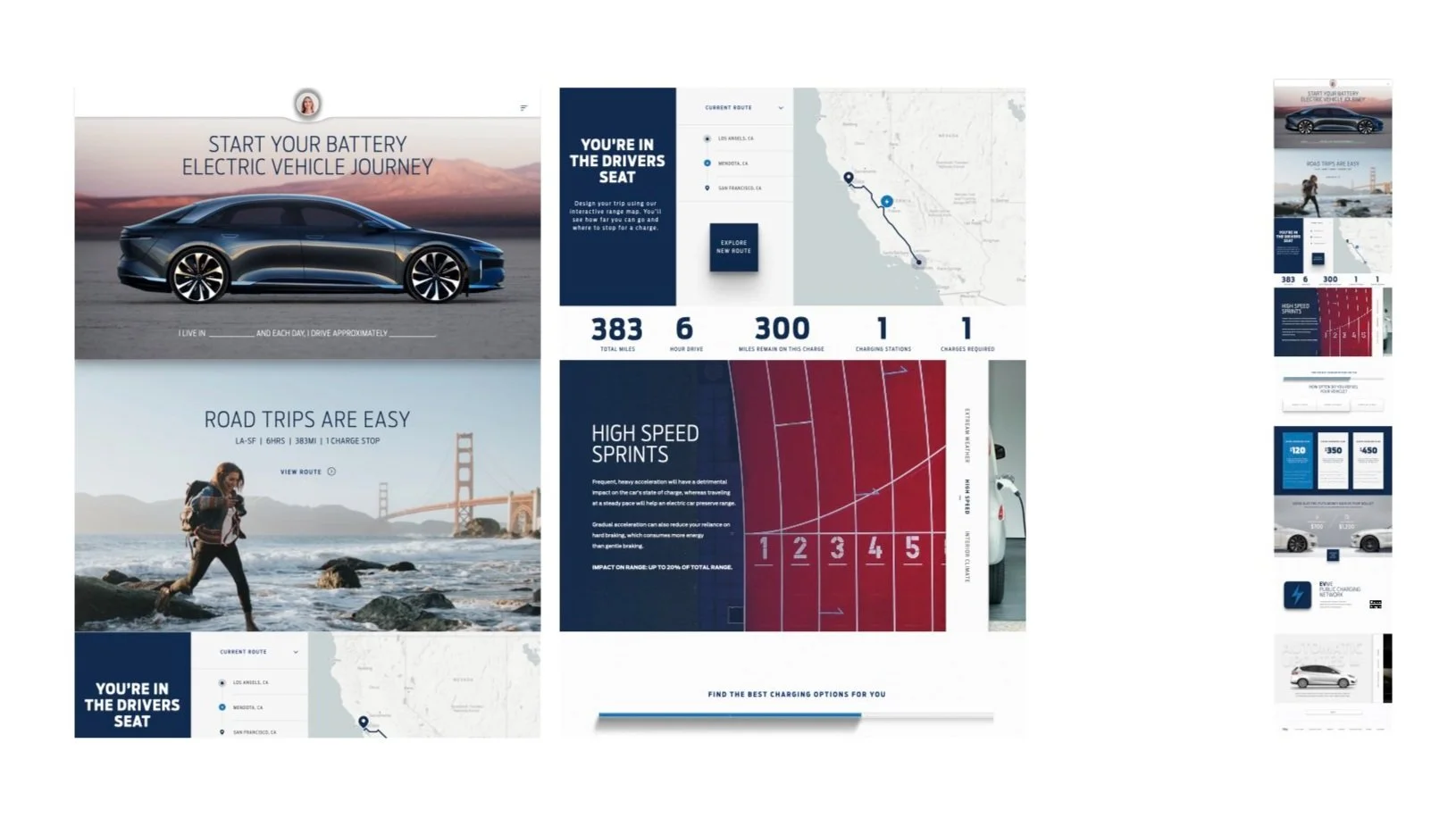
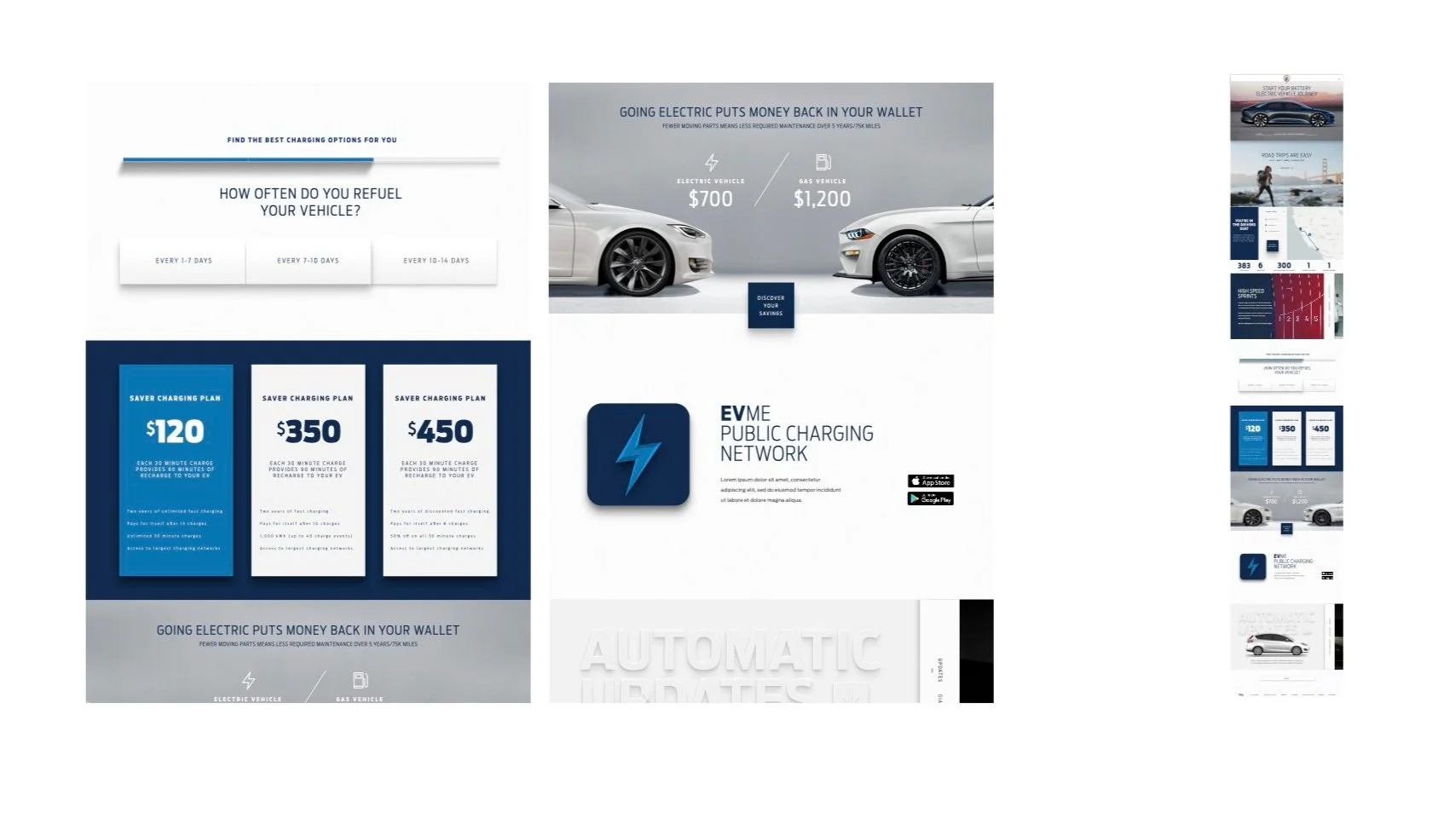
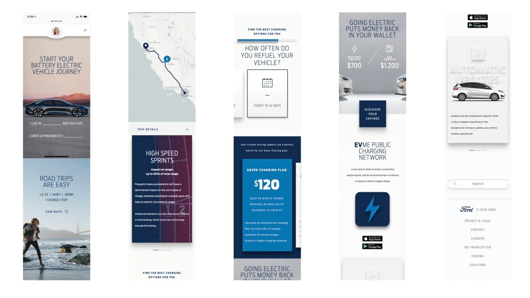
What I Fed Into the System
My contribution was scoped to what the Web workstream could validate at production scale during the Owner Web AEM 6.1 → 6.4 migration. Each component went through the FDS evaluation pipeline — stress-tested against App and In-Vehicle contexts by the dedicated team — before adoption into the system.
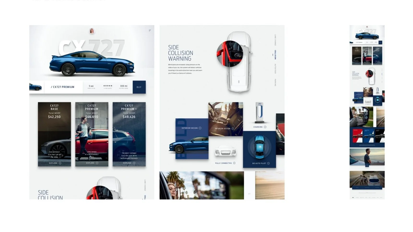
Authentication + SSO Patterns
Sign-in, account creation, password reset, consent flows. Foundational auth patterns used across the Ford digital ecosystem. Tested at production scale across NA and Europe, validated against mobile (FordPass) and in-vehicle auth contexts by the FDS team before adoption.
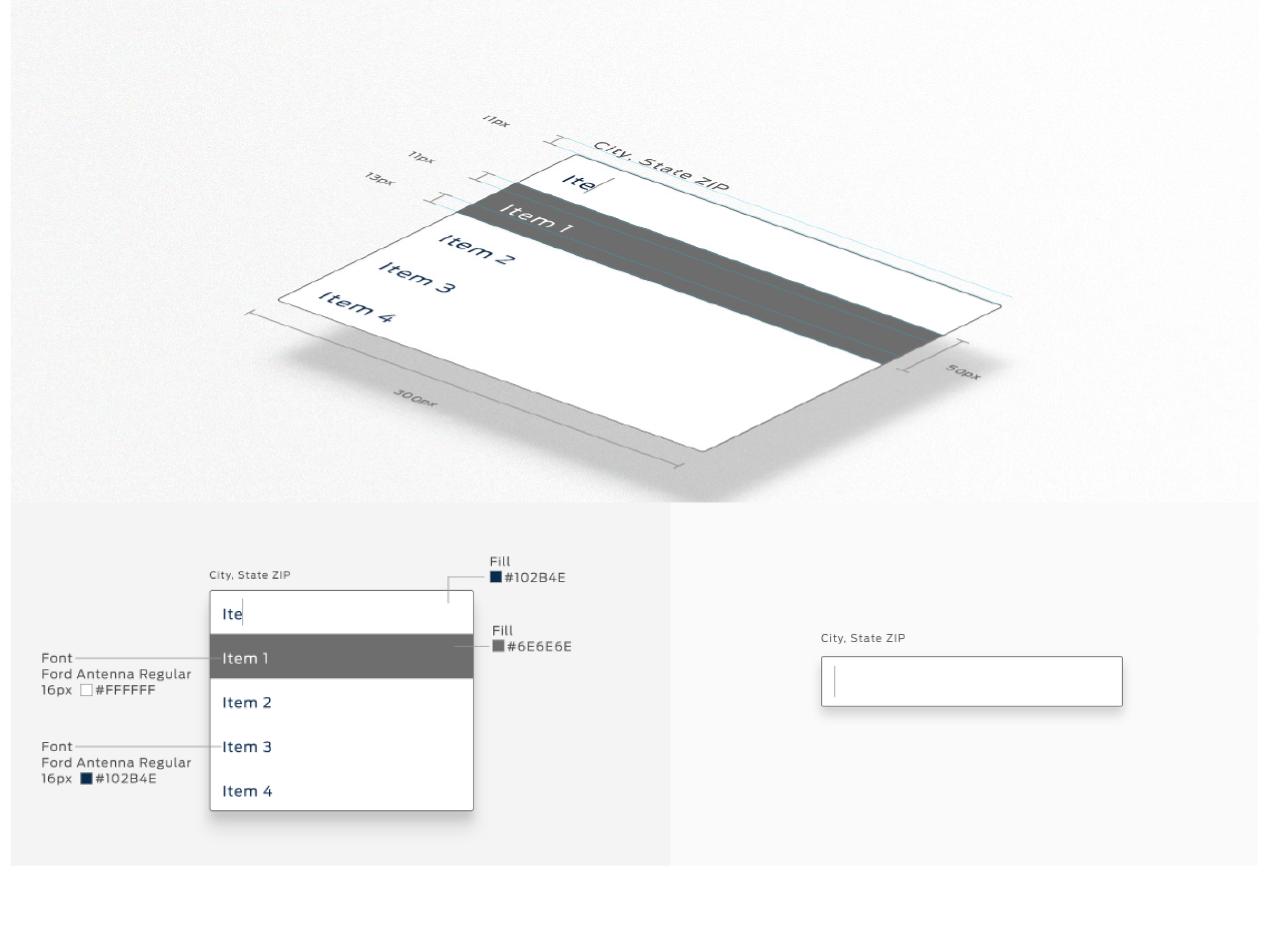
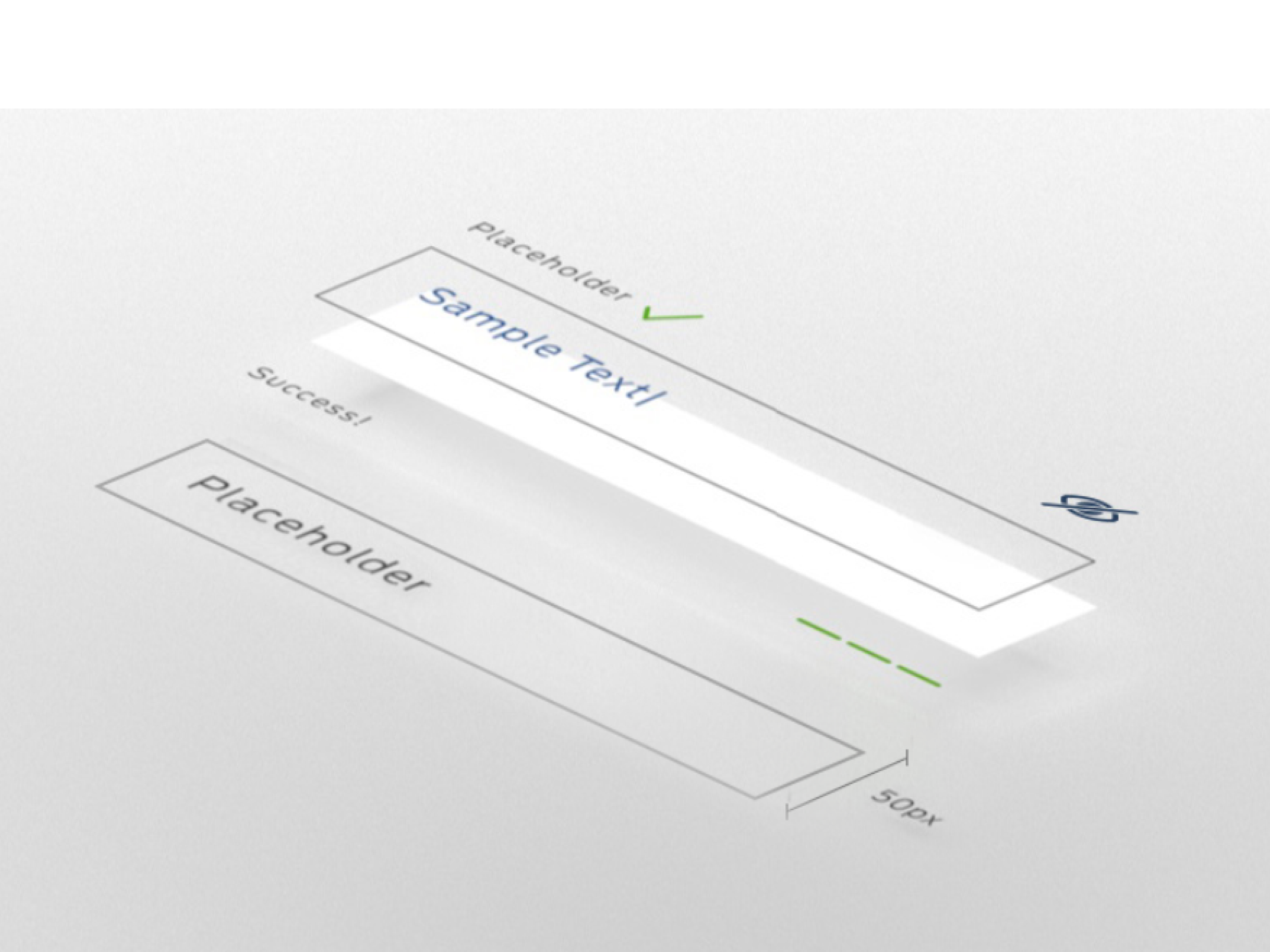
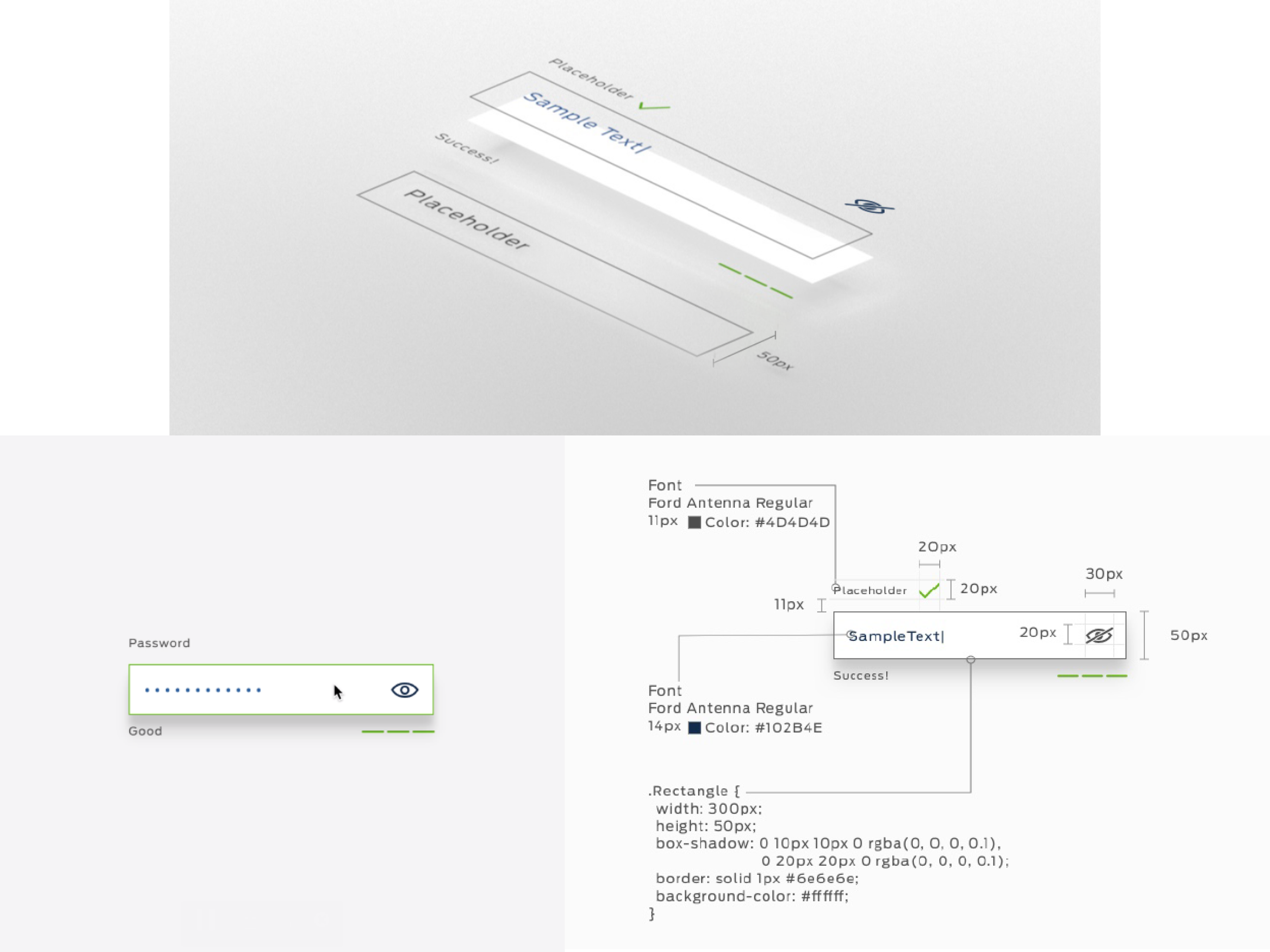
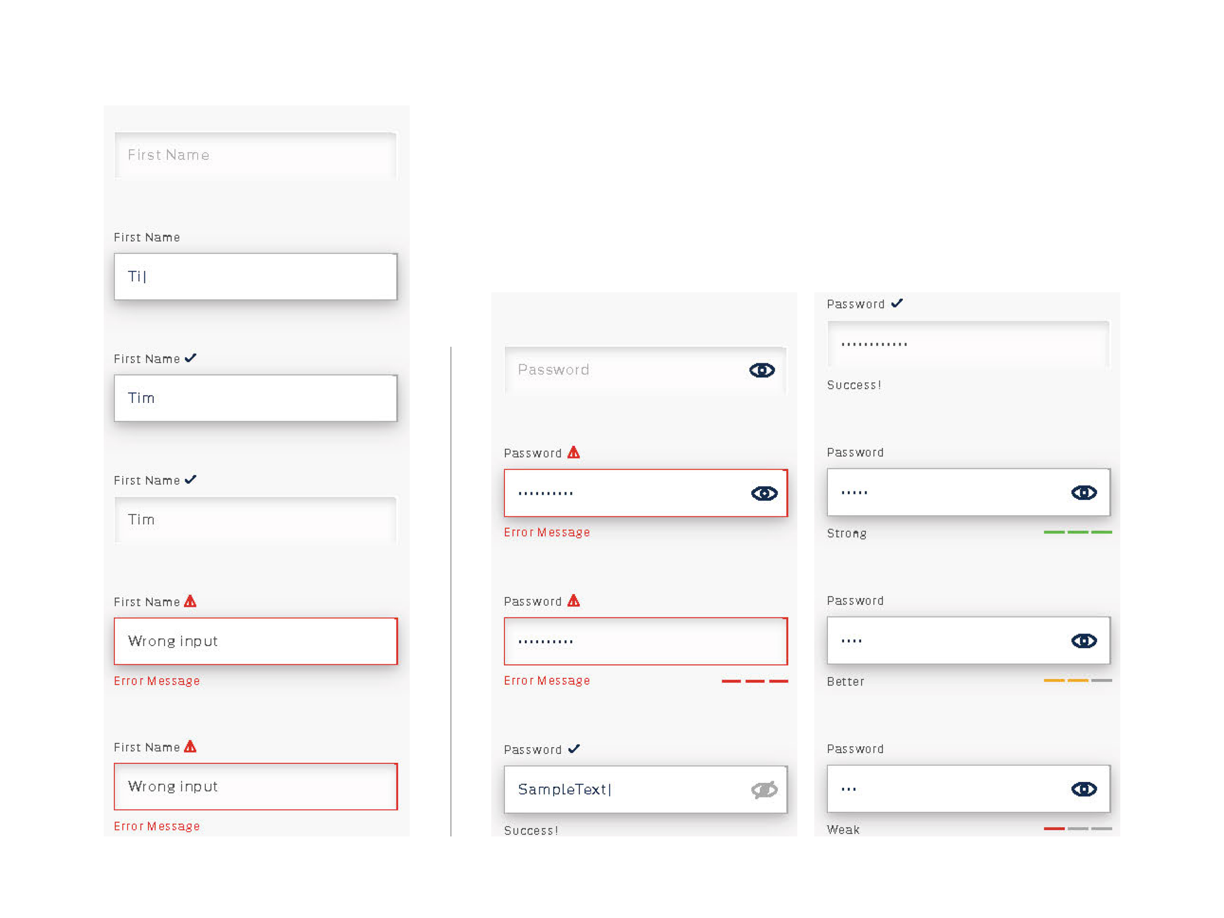
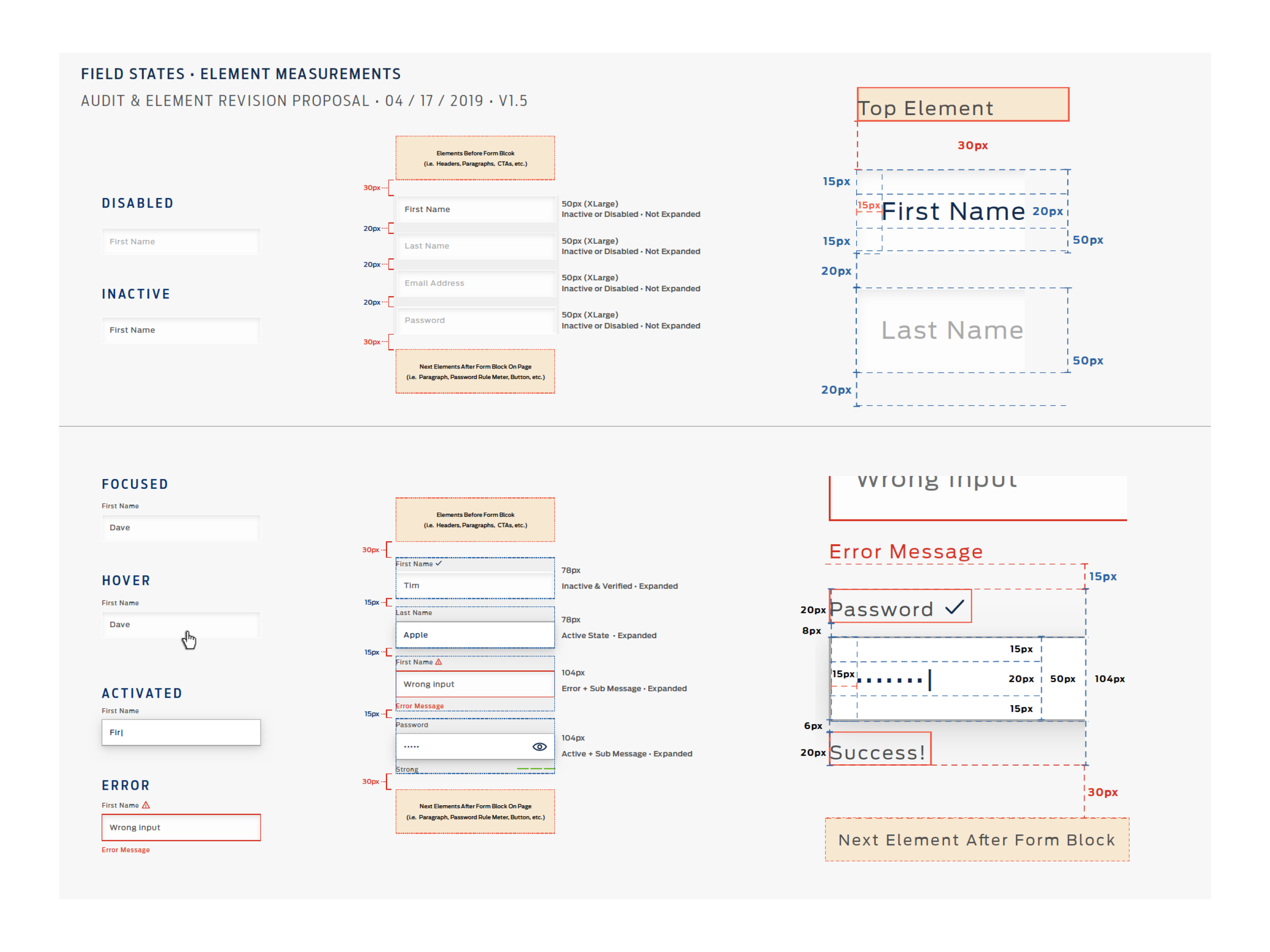
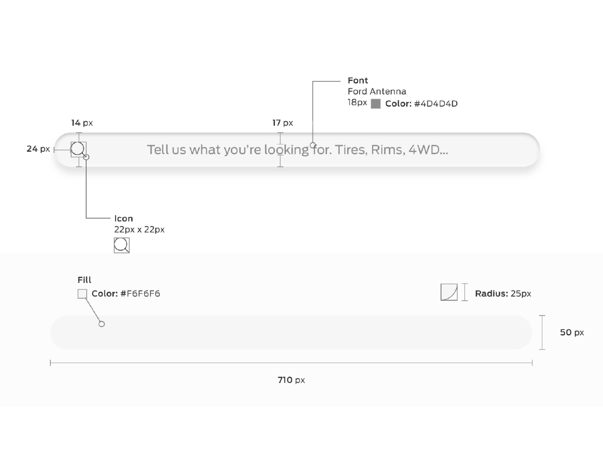
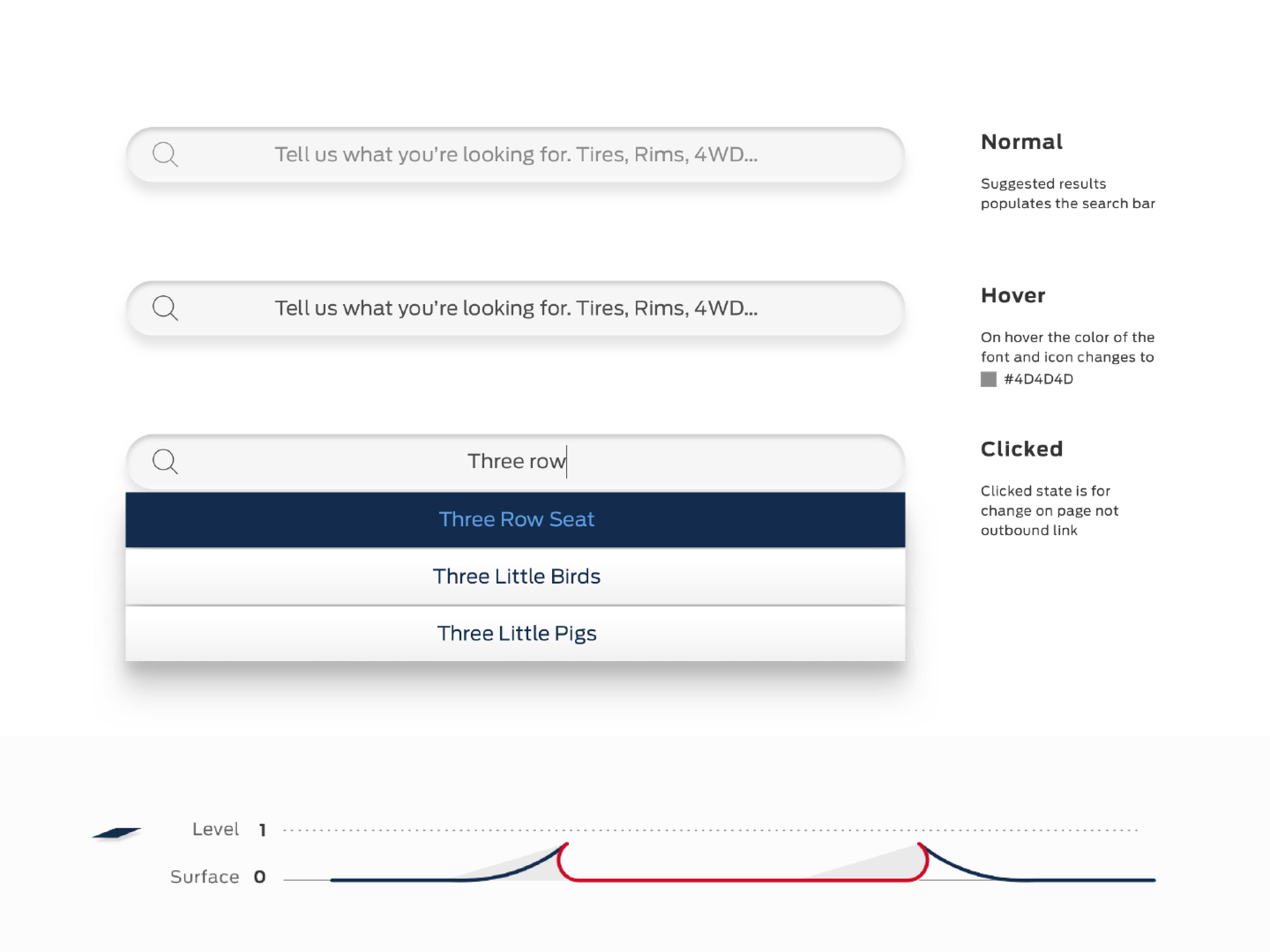
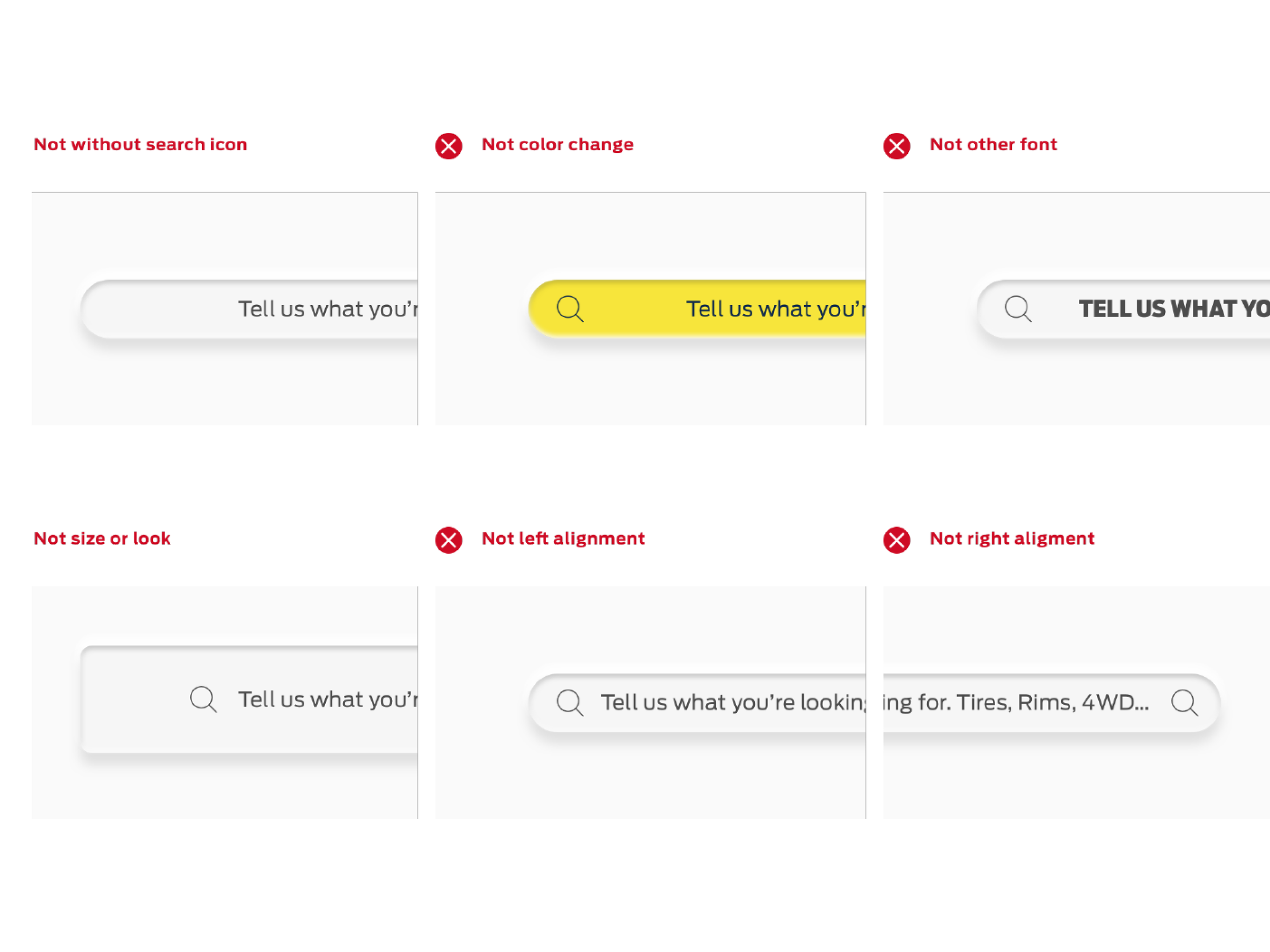
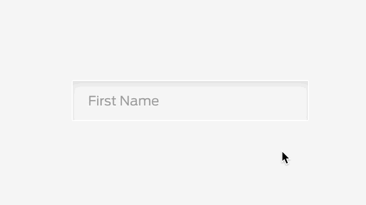
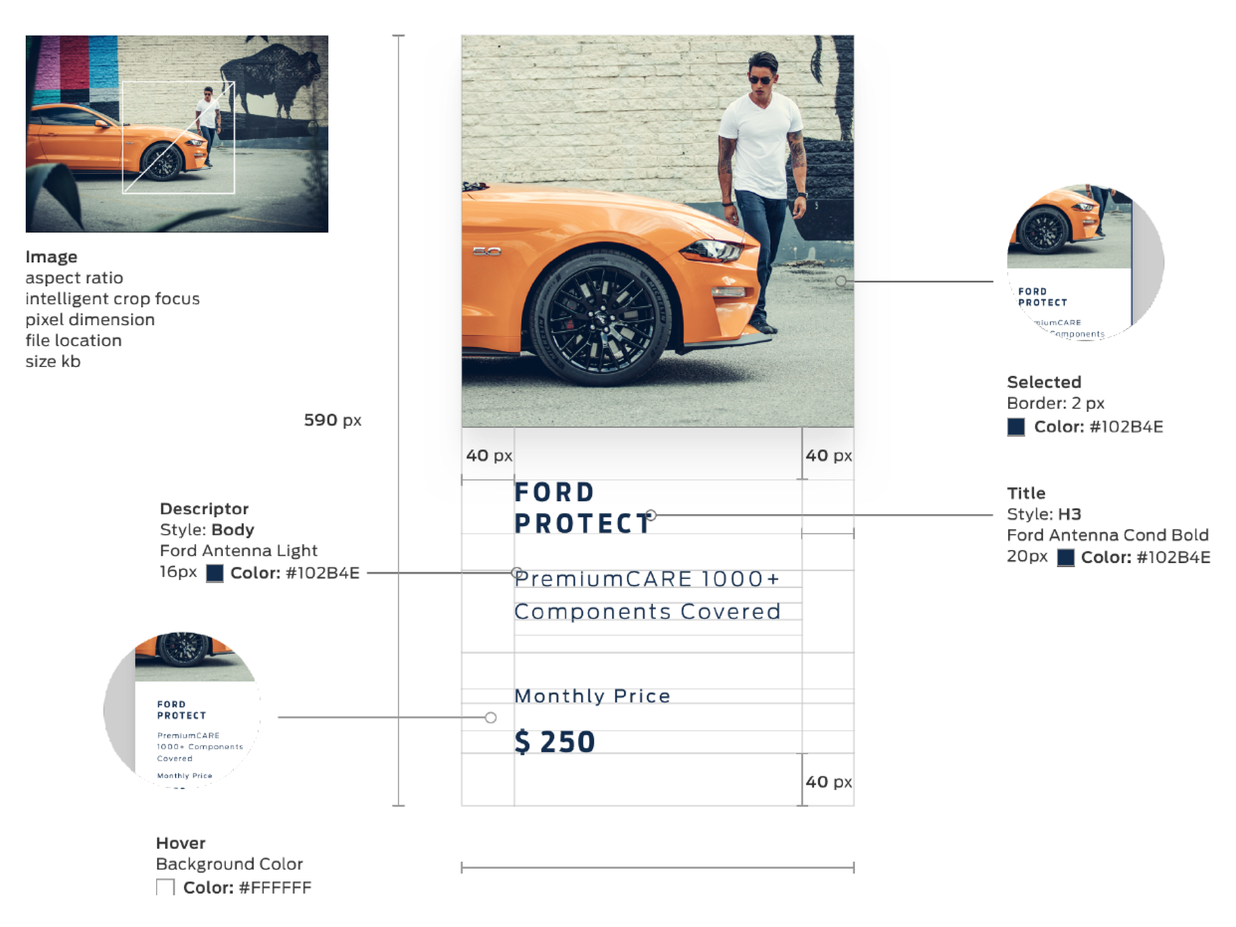
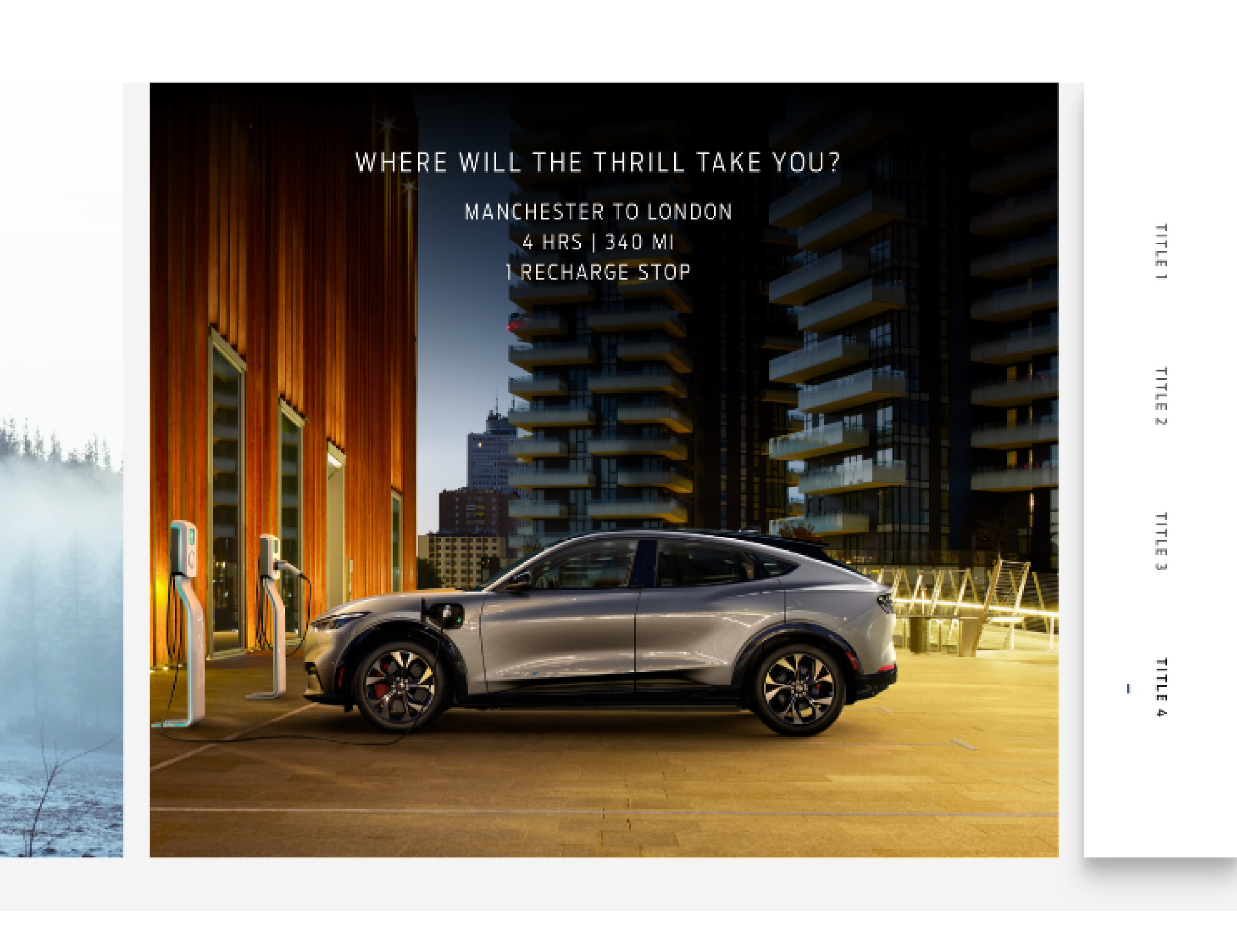
Form Elements + Input Behaviors
Input fields, dropdowns, selection controls, validation states, error messaging. Designed against three-surface interaction constraints — desktop cursor, mobile touch, in-vehicle glance. Accessibility embedded during build, not after.
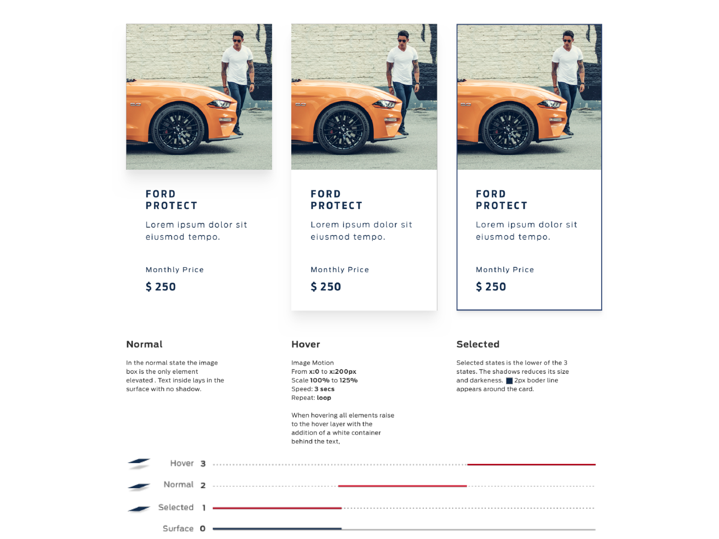
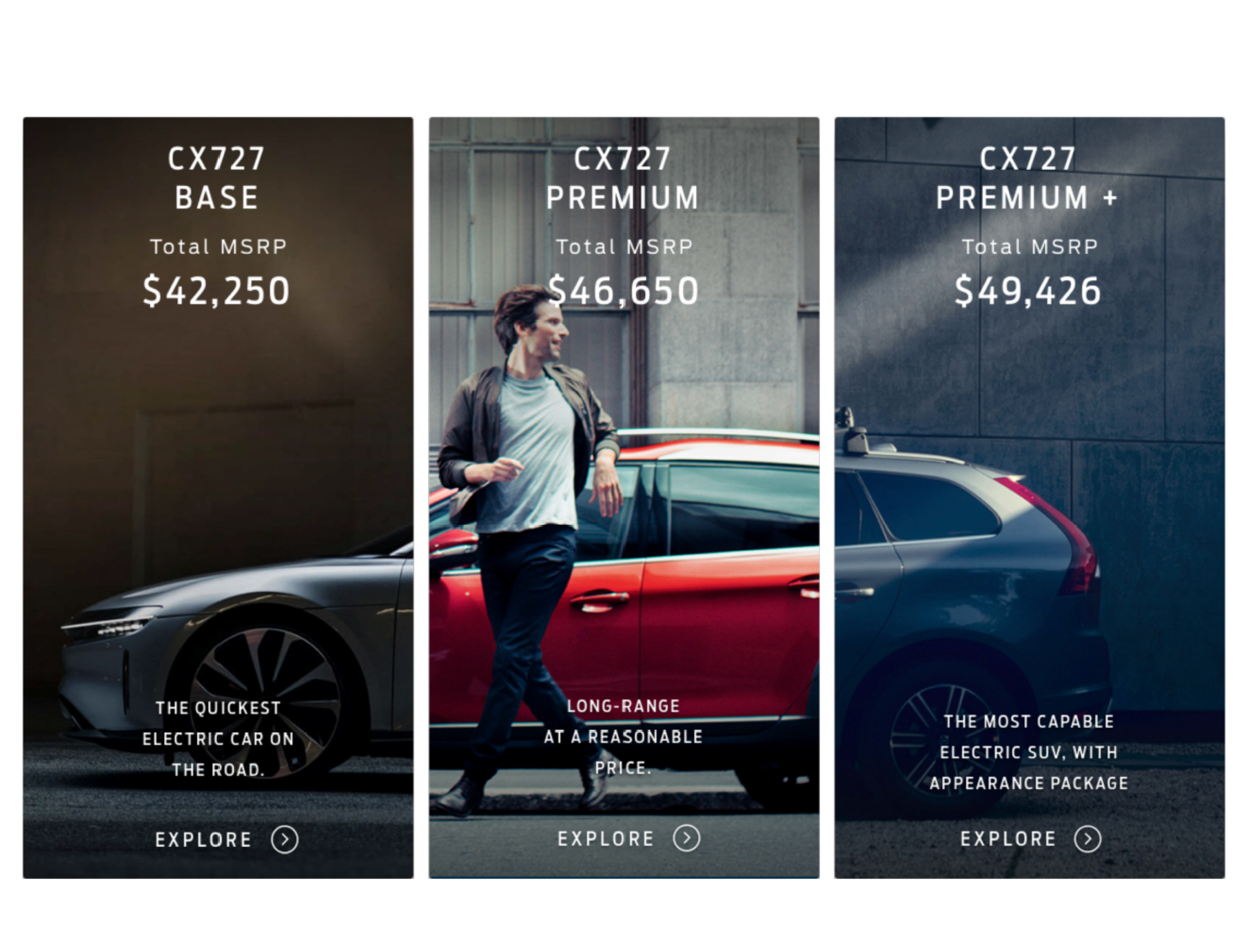
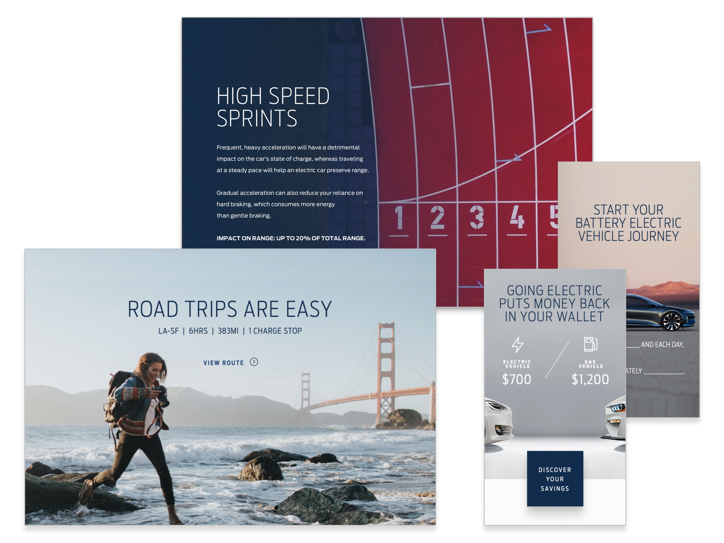
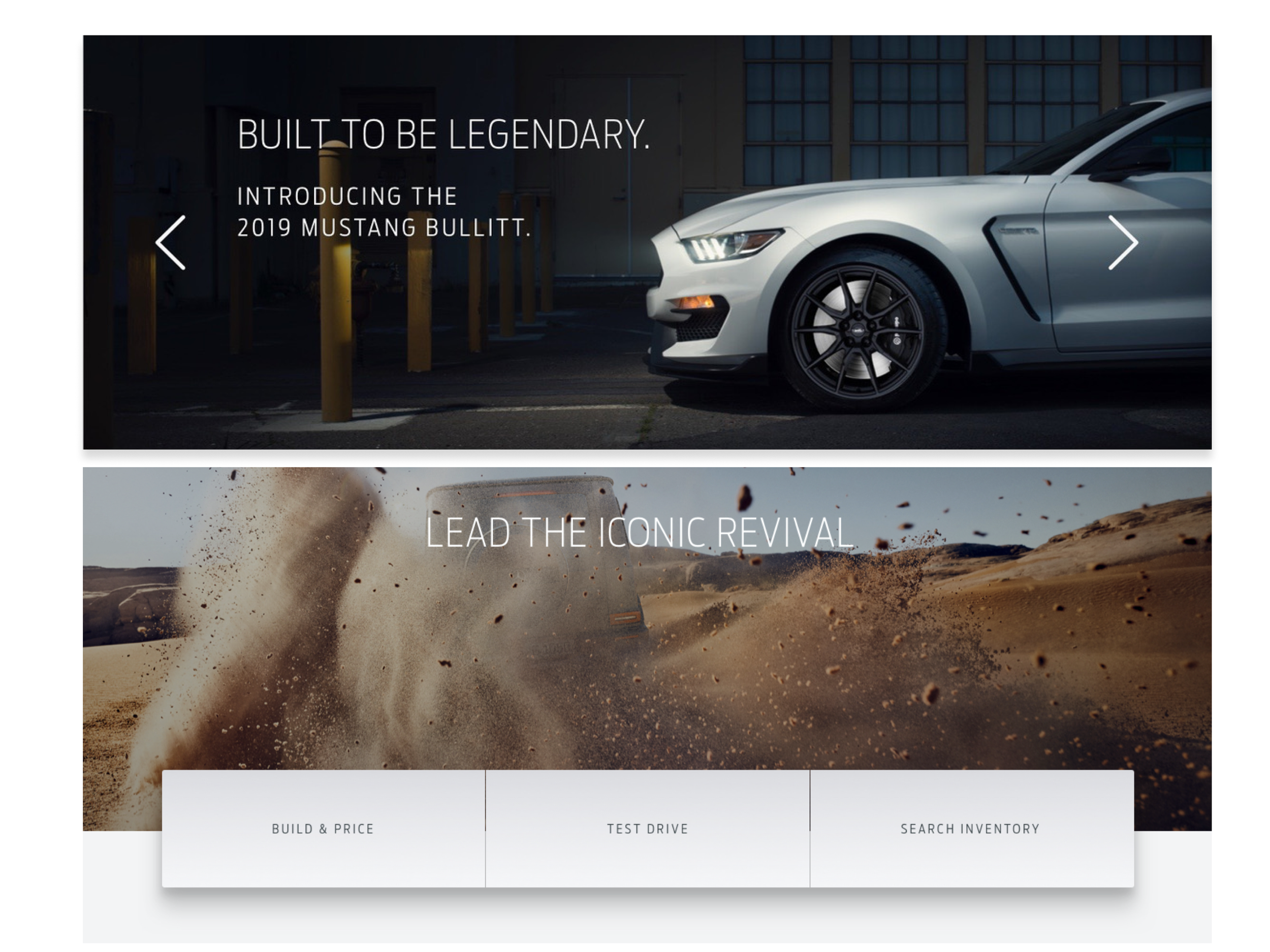
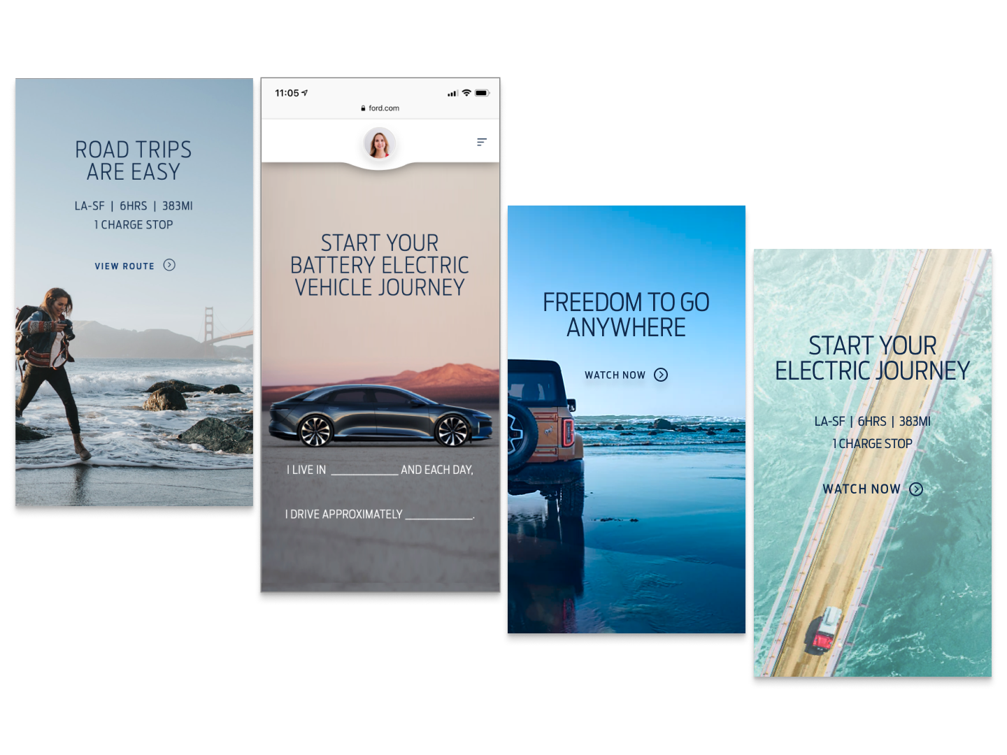
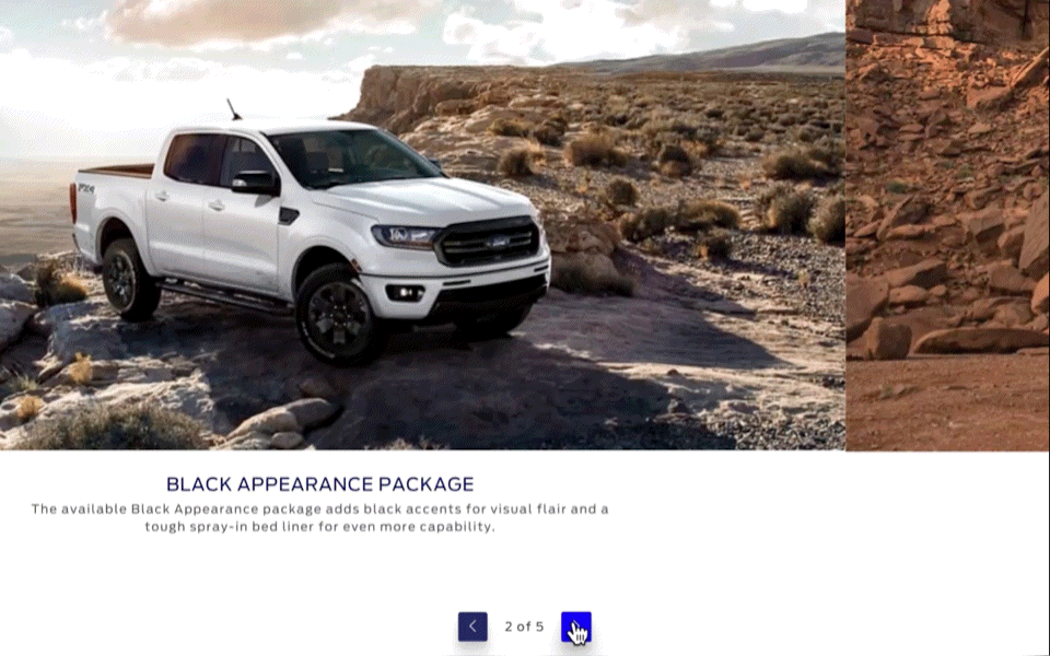
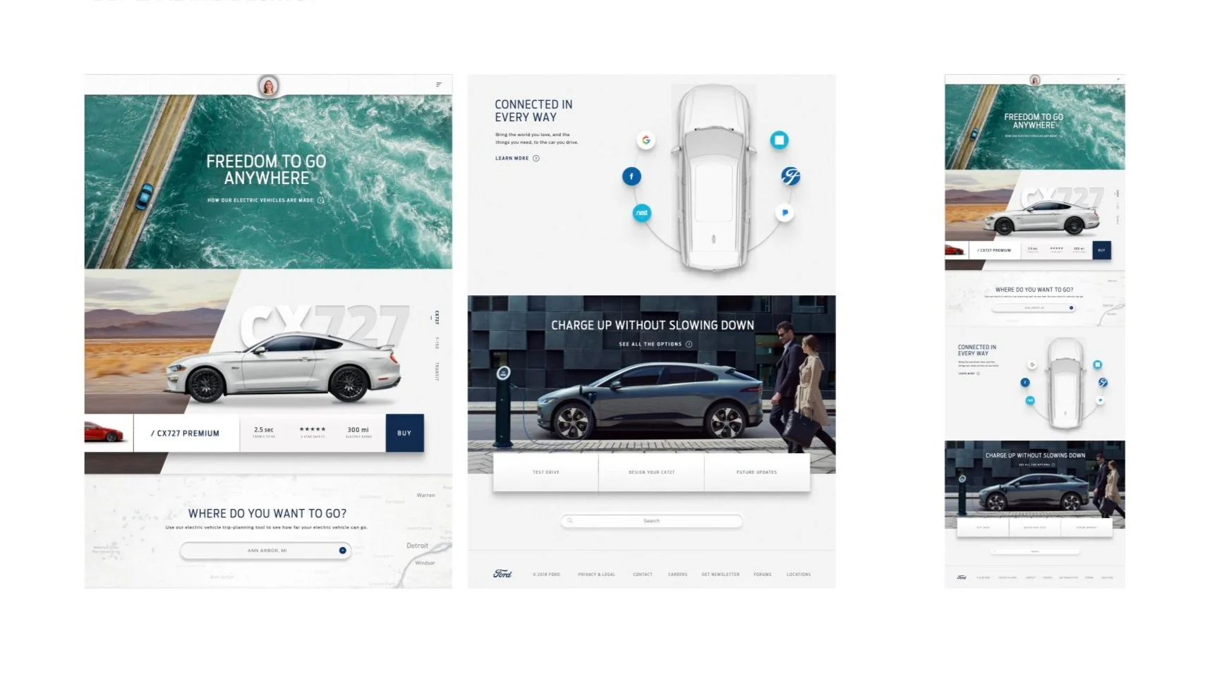
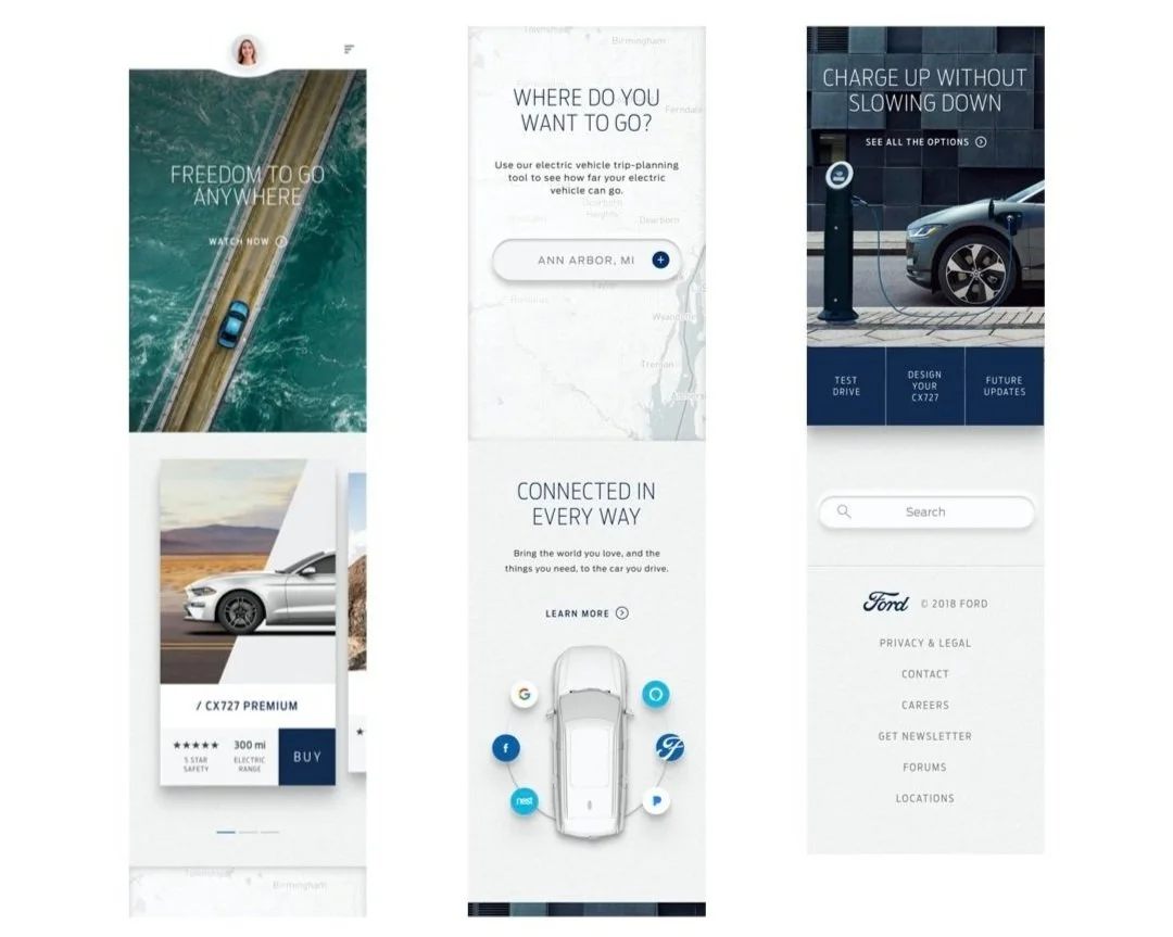
Content Modules + Cards
Content card systems, hero modules, feature blocks. Authorable across regions without requiring regional design intervention. Structured for internationalization — variable content density, RTL considerations, multi-language support built into the component architecture.
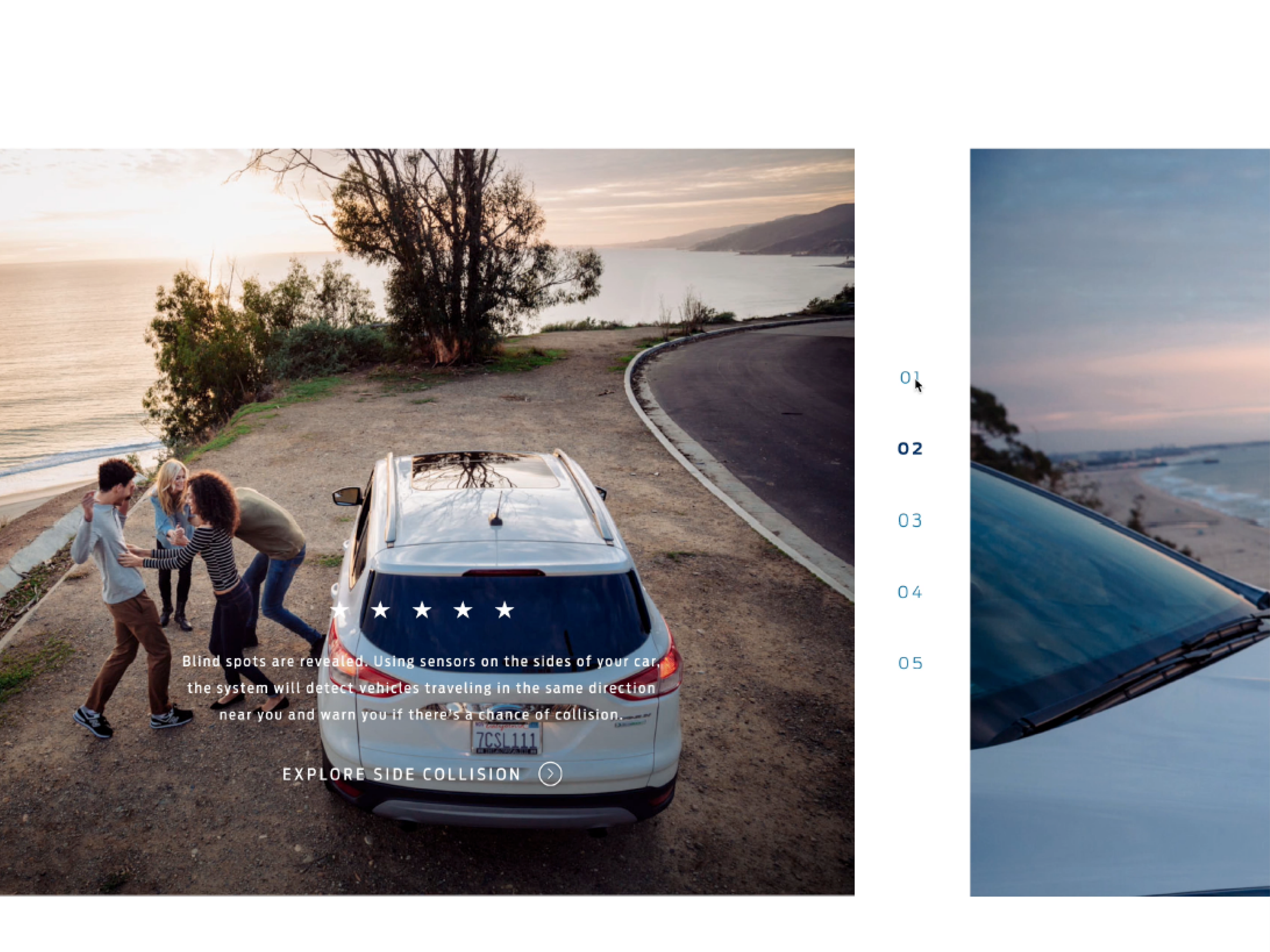
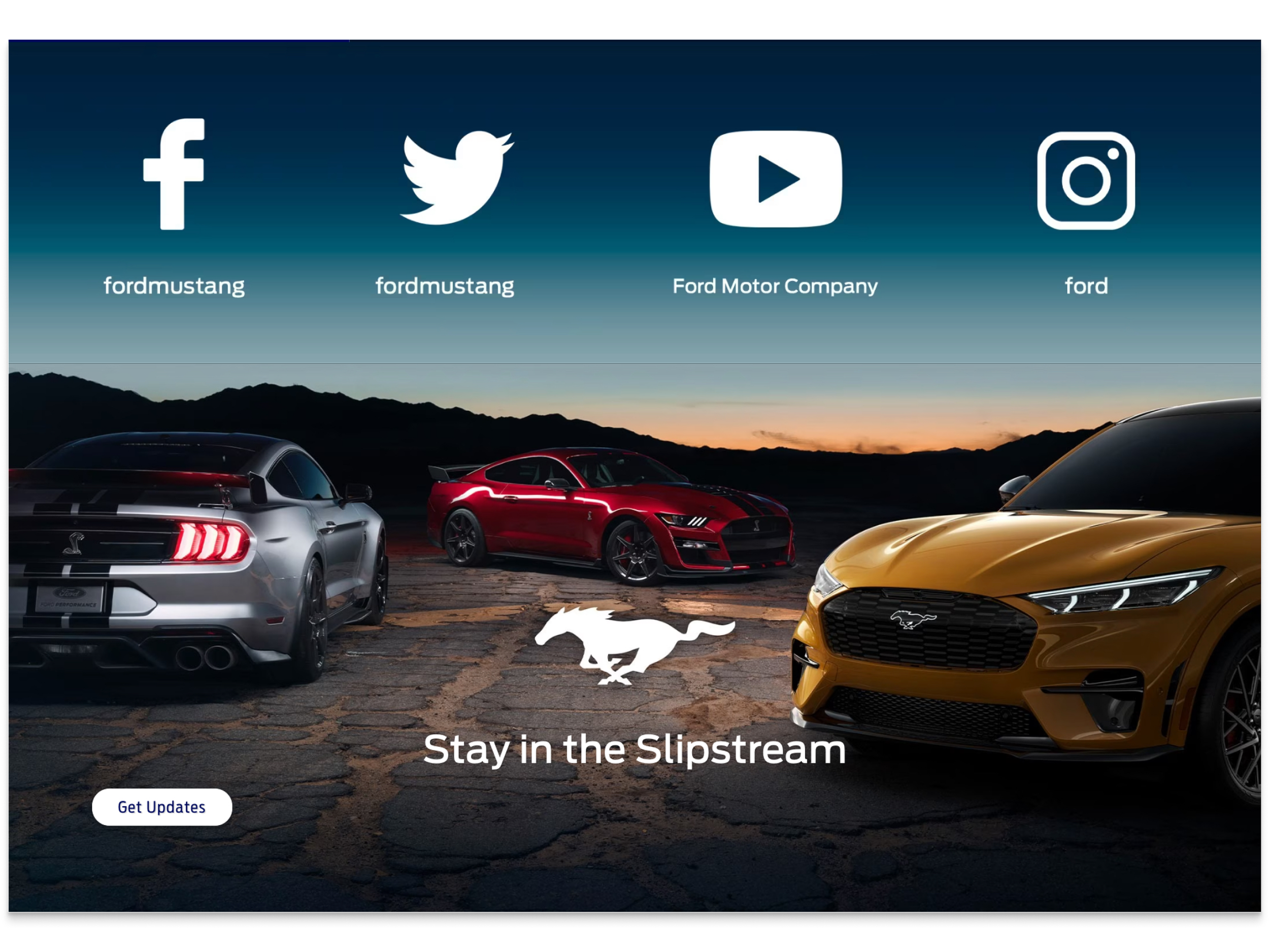
Navigation Patterns
Primary navigation, secondary navigation, breadcrumbs, utility navigation. Structural patterns that any Ford digital surface could consume without rebuilding. Tested against multi-level information hierarchies common to automotive digital products.
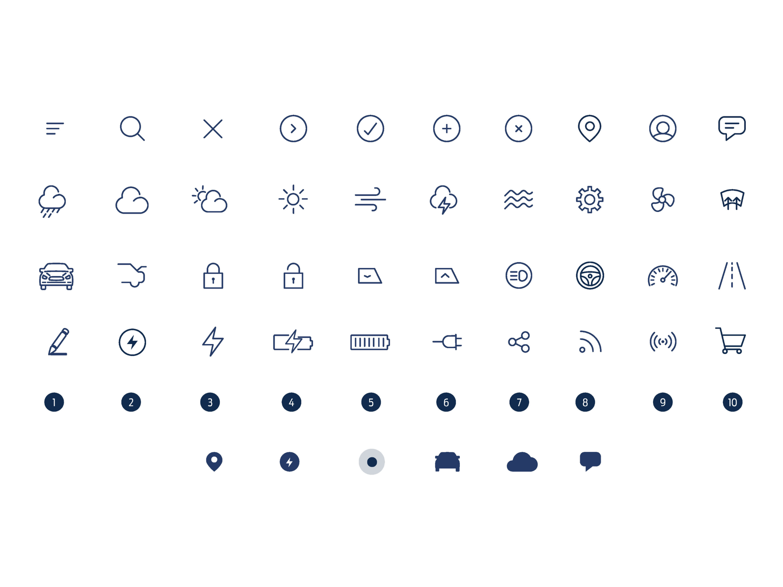
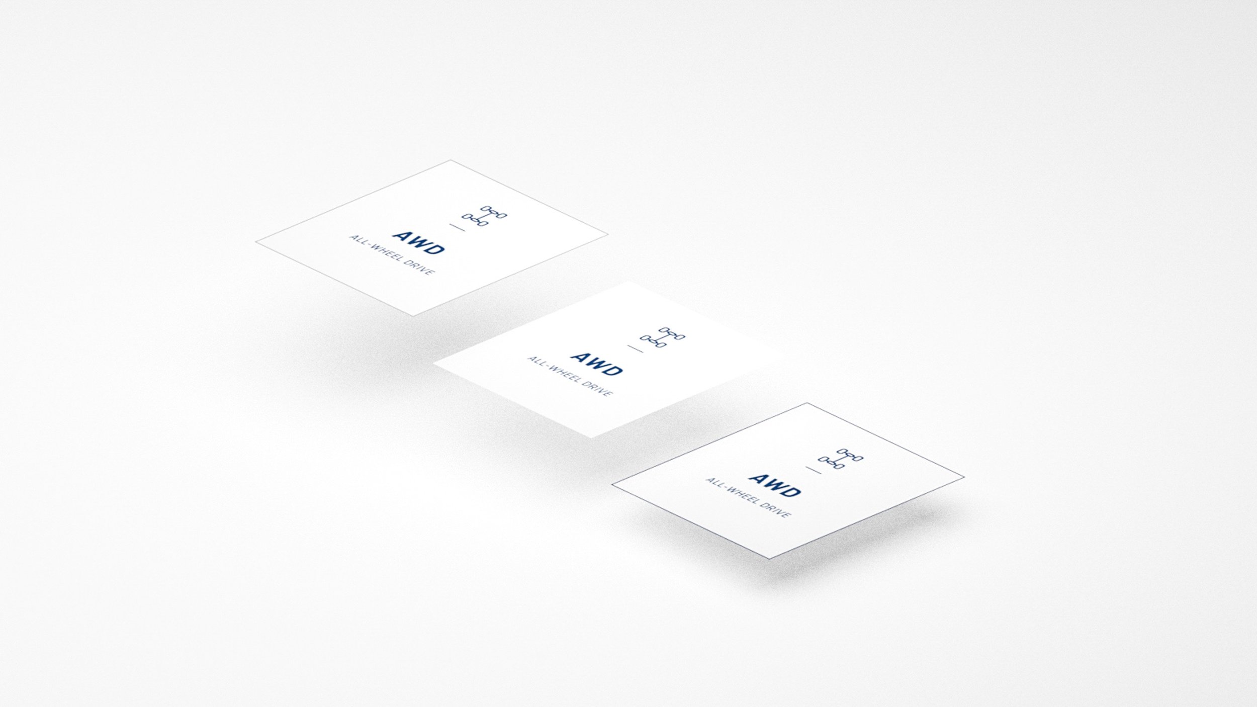
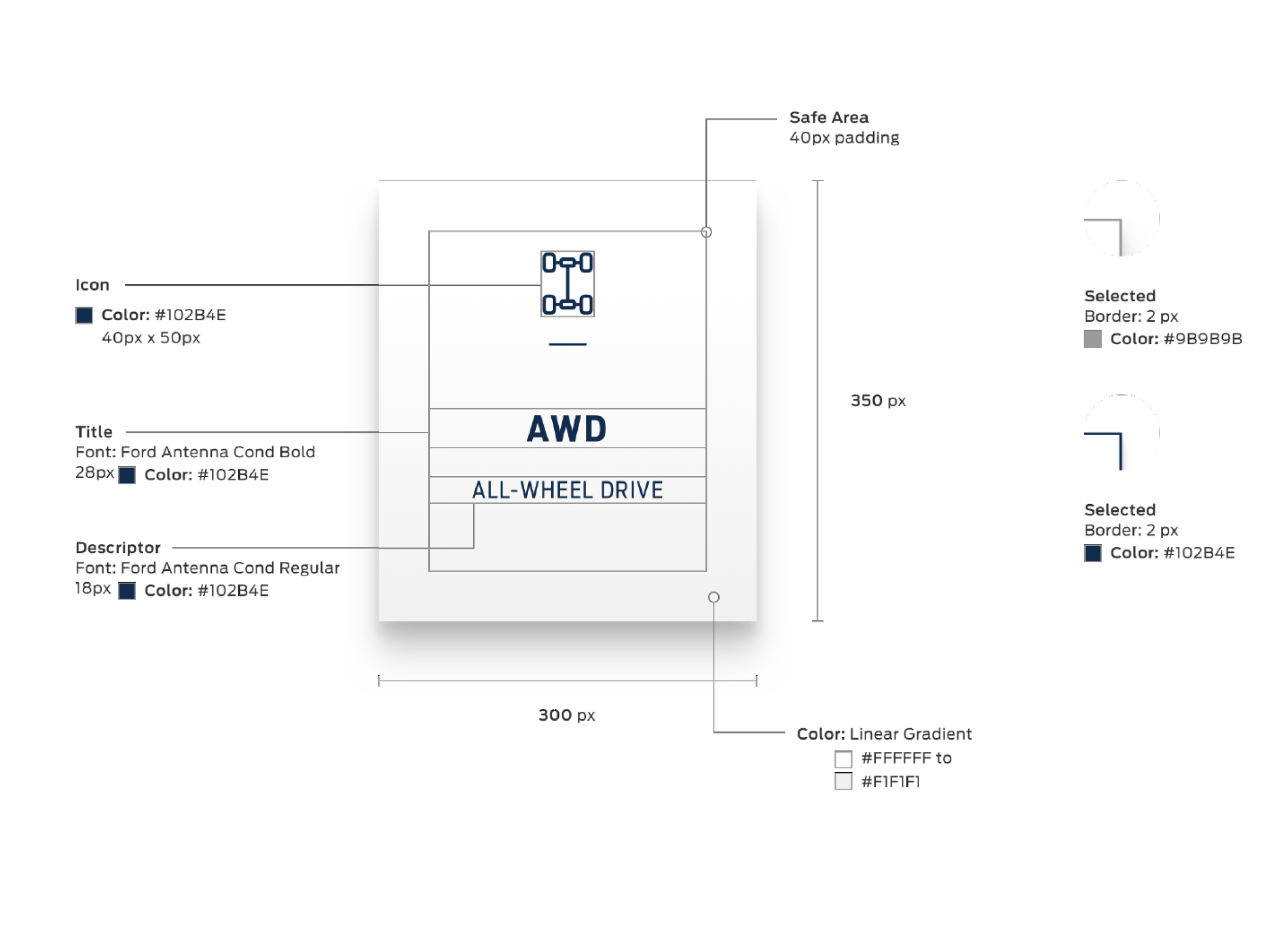
Icon Library Contributions
Contributed to the shared icon library based on needs emerging across workstreams — Owner Web, FordPass App, and in-vehicle contexts. Each icon had to work at multiple scales, across light and dark themes, and across interaction states.
Why These Adopted
Every component I fed into the system met three simultaneous constraints: migration-grade (shipped under production pressure), market-agnostic (worked across NA and Europe without modification), and FDS-aligned (designed against emerging system standards). Production rigor is the hardest constraint to retrofit into a Design System component — and it's why a disproportionate share of my migration work was validated by the FDS team and adopted as early functional inputs.
In Production. Globally. Ongoing.
The Ford Design System (FDS) is not a dead artifact. It shipped in 2019, became the governance layer for Ford's digital ecosystem, and is still in active use and active evolution today — six years later. It is the foundational design infrastructure that powers everything Ford ships digitally, from Owner Web to FordPass to the in-vehicle Ford Digital Experience to Ford Signature 2.0 dealership rollouts.
Global Adoption — Still Expanding
The FDS is in active use today across North America, South America, China, and Europe. Every Ford digital consumer experience — regardless of region, brand, or surface — is built on or governed by it. This was not a one-and-done deliverable. It is Ford's ongoing design infrastructure.
Design–Dev Source of Truth
The GitHub code kit means design tokens, component specs, and interaction patterns are published once and consumed everywhere. Eliminated the translation gap that breaks most Design Systems at scale. Product Teams build faster because they're not rebuilding foundations every sprint.
Accessibility by Default
WCAG 2.1 compliance was embedded at the component level from the system's first release. Every Ford Product Team consuming the FDS inherits accessible UI by default. No catch-up audits. No downstream remediation debt. Accessibility as infrastructure, not a checkbox.
Multi-Brand Scale — Ford + Lincoln
The FDS supports both Ford and Lincoln digital expressions from one governance layer. Shared foundations, shared component library, brand-specific expression at the token level. One system, two brands, zero duplicated infrastructure.
Foundation for What Came After
The FDS was the infrastructure that enabled everything Ford has shipped digitally since 2019 — the unified Ford Digital Experience in-vehicle, the redesigned FordPass platform, Ford Signature 2.0 dealership rollouts (2025), and continued EV platform launches. Every one of those initiatives stood on the Design System as its substrate.
One System. Every Surface.
Every Region. Every Brand. The Ford Design System (FDS) is the governance layer that unifies how Ford shows up digitally everywhere. Three surfaces. Four regions. Two brands. One consistent customer experience. Still evolving as Ford's digital ecosystem expands into new vehicle platforms, new retail experiences, and new customer touchpoints.
 Web
Owner.Ford.com, Ford.com, Lincoln.com, regional marketing sites, dealer portals. Every Ford web surface built on or governed by the FDS — globally consistent, regionally authorable.
Web
Owner.Ford.com, Ford.com, Lincoln.com, regional marketing sites, dealer portals. Every Ford web surface built on or governed by the FDS — globally consistent, regionally authorable.
 App
FordPass, Lincoln Way, and regional Ford mobile applications. Native iOS and Android experiences built on the same design tokens, the same component library, the same interaction patterns as web and in-vehicle.
App
FordPass, Lincoln Way, and regional Ford mobile applications. Native iOS and Android experiences built on the same design tokens, the same component library, the same interaction patterns as web and in-vehicle.
 In-Vehicle
The Ford and Lincoln Digital Experience — infotainment, cluster displays, HMI layers across every Ford and Lincoln connected vehicle. The FDS informs the visual and interaction language of the cabin itself.
Ford Owner Web Case Study →
VMLY&R was hired to build Ford's first-ever universal Design System — Project Edison. The goal was to unify Ford's fragmented digital ecosystem into one consistent customer experience across every surface, every region, every brand. I contributed from the Web workstream during the foundational build. Six years later, the system is still in production globally and continues to evolve as Ford's digital footprint expands.
In-Vehicle
The Ford and Lincoln Digital Experience — infotainment, cluster displays, HMI layers across every Ford and Lincoln connected vehicle. The FDS informs the visual and interaction language of the cabin itself.
Ford Owner Web Case Study →
VMLY&R was hired to build Ford's first-ever universal Design System — Project Edison. The goal was to unify Ford's fragmented digital ecosystem into one consistent customer experience across every surface, every region, every brand. I contributed from the Web workstream during the foundational build. Six years later, the system is still in production globally and continues to evolve as Ford's digital footprint expands.
Every Region. Every Brand. The Ford Design System (FDS) is the governance layer that unifies how Ford shows up digitally everywhere. Three surfaces. Four regions. Two brands. One consistent customer experience. Still evolving as Ford's digital ecosystem expands into new vehicle platforms, new retail experiences, and new customer touchpoints.
Regional Coverage
North America · South America · China · Europe. One system localized for four markets — different languages, different regulatory environments, different content conventions — all consuming the same design tokens, the same component library, the same source of truth.
Ongoing Evolution
The FDS is not a frozen deliverable. It has been iterated continuously since 2019 as Ford's digital ecosystem has expanded — new EV platforms, new connected vehicle experiences, new retail strategies (Ford Signature 2.0 in 2025). The system scales with the business.
The Contribution
My role was the Web contribution layer during the system's foundational build period (2019-2020). The components I fed in are still in the system, still governing Ford Owner Web, still being referenced by downstream patterns across every surface the FDS touches.
ECOSYSTEM

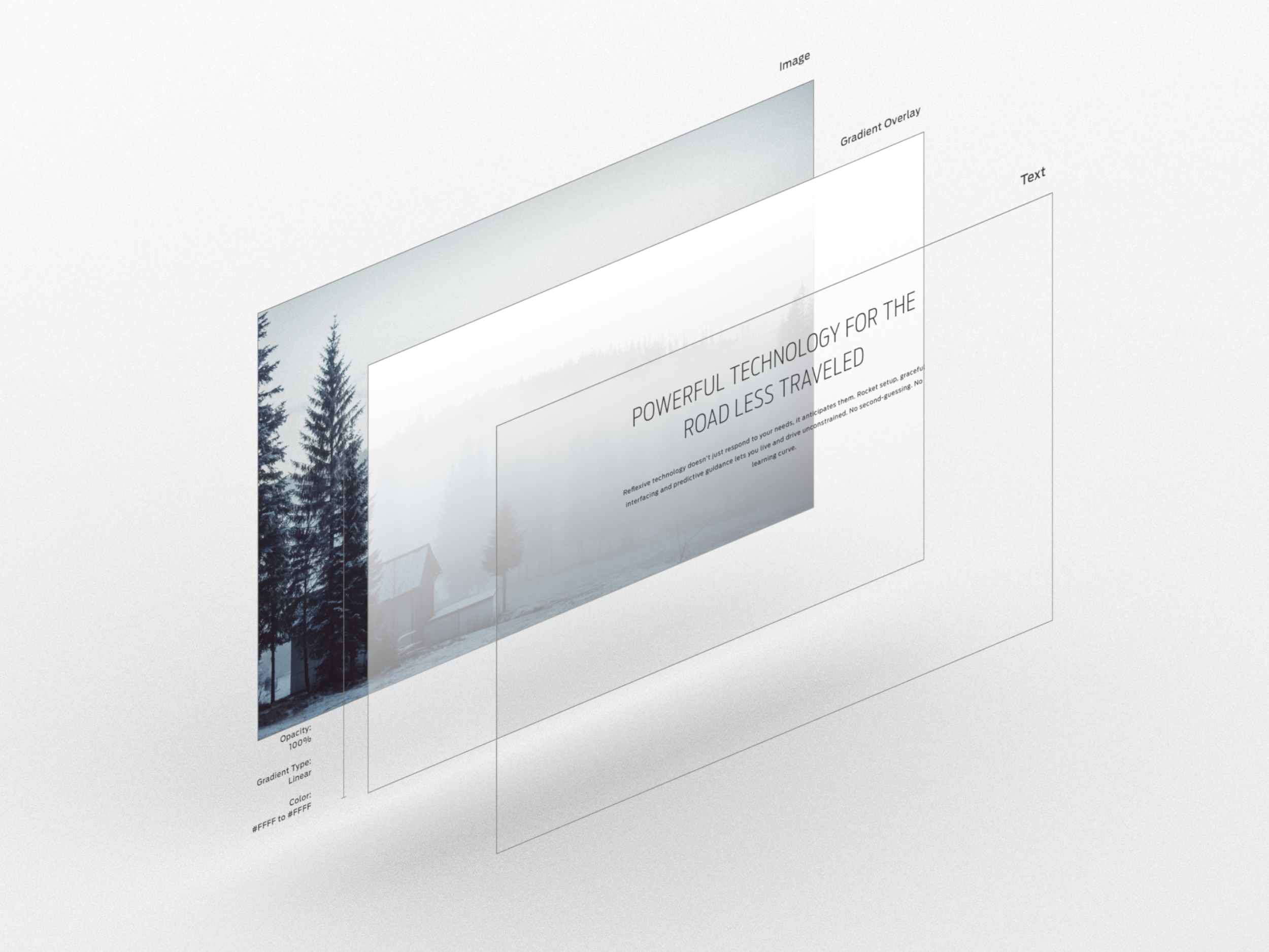
ENVIRONMENT
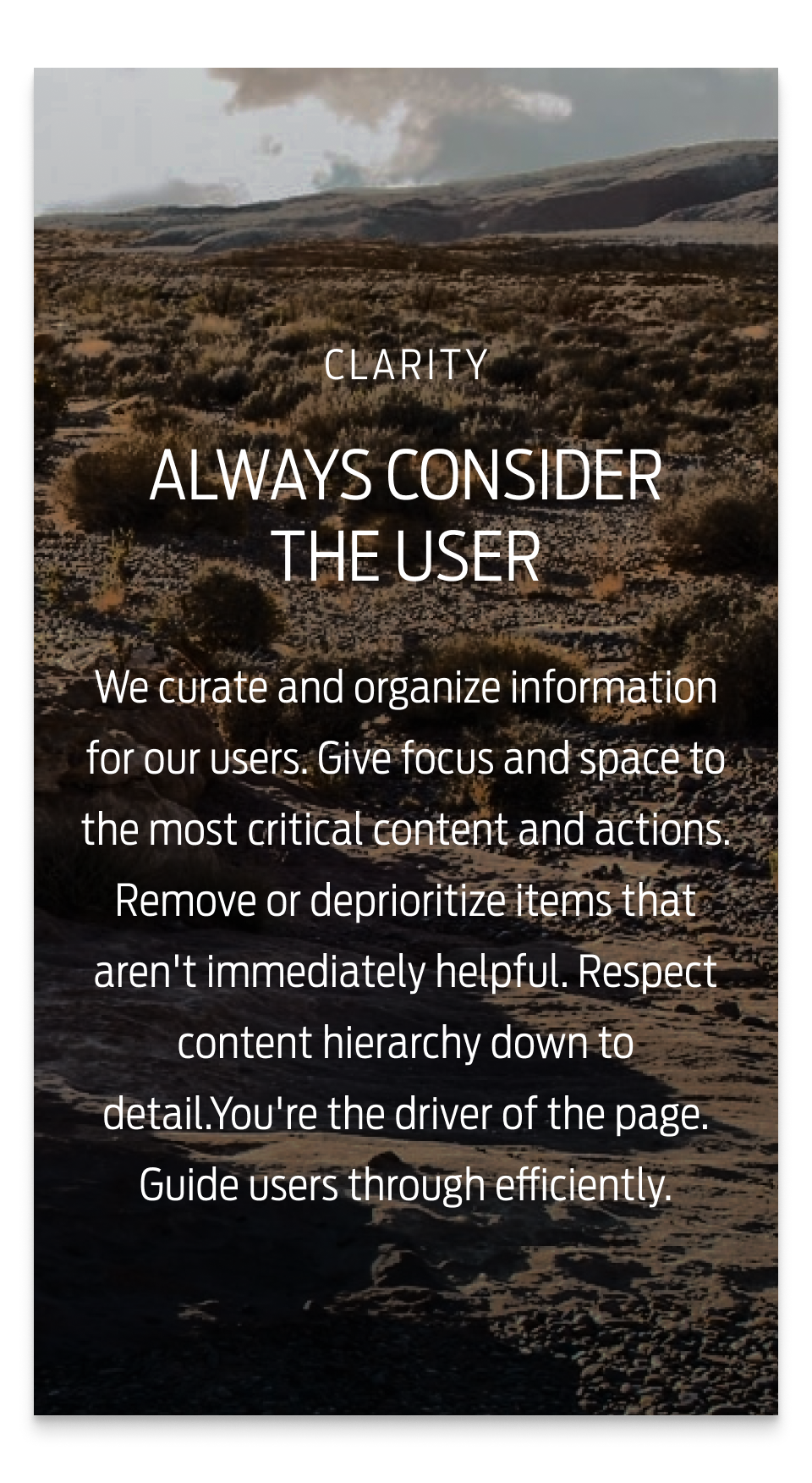
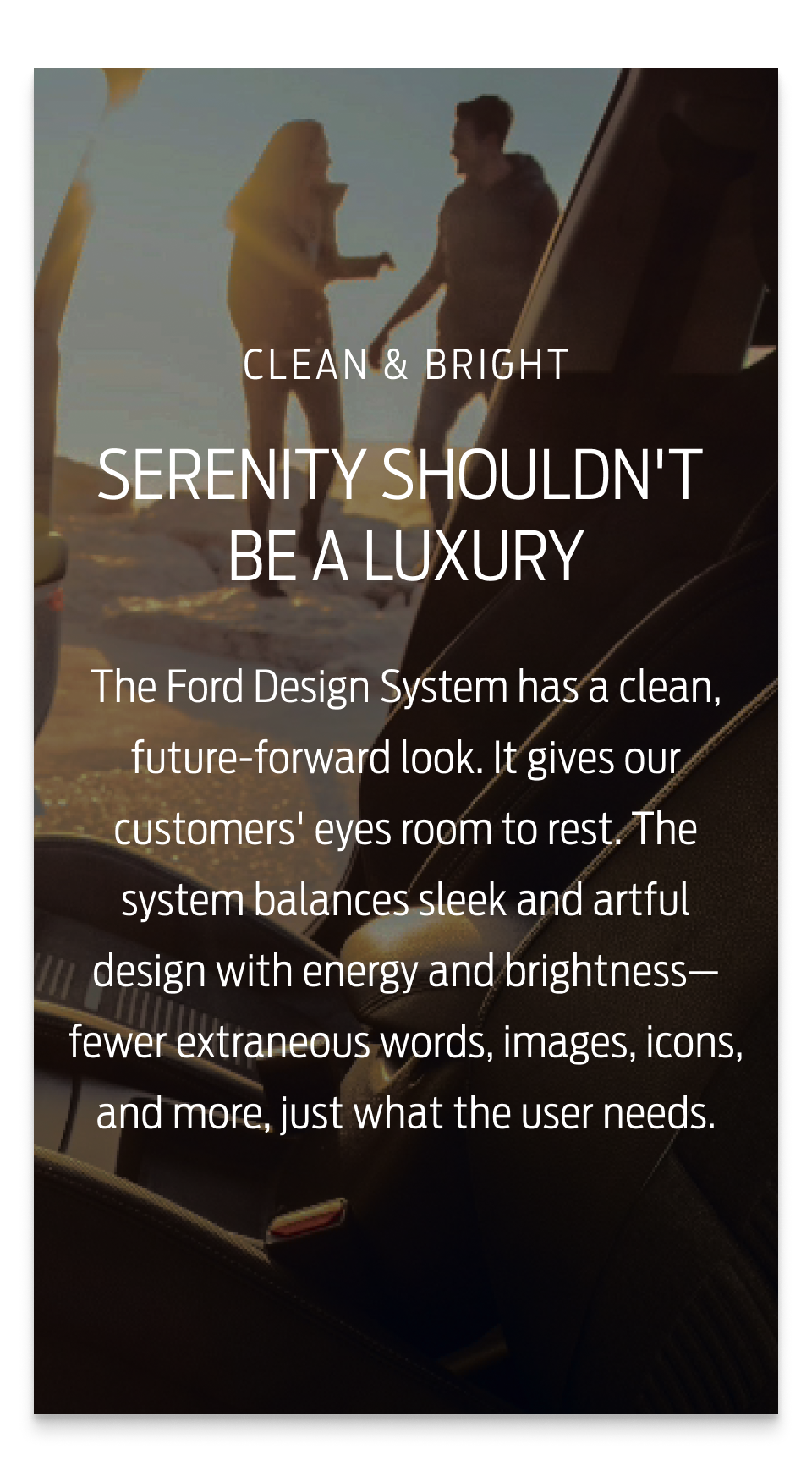
This system is about eliciting a the feeling of obtainable premium and removing the noise and confusion. A a place where every piece of content lives in organized chaos.

SURFACE
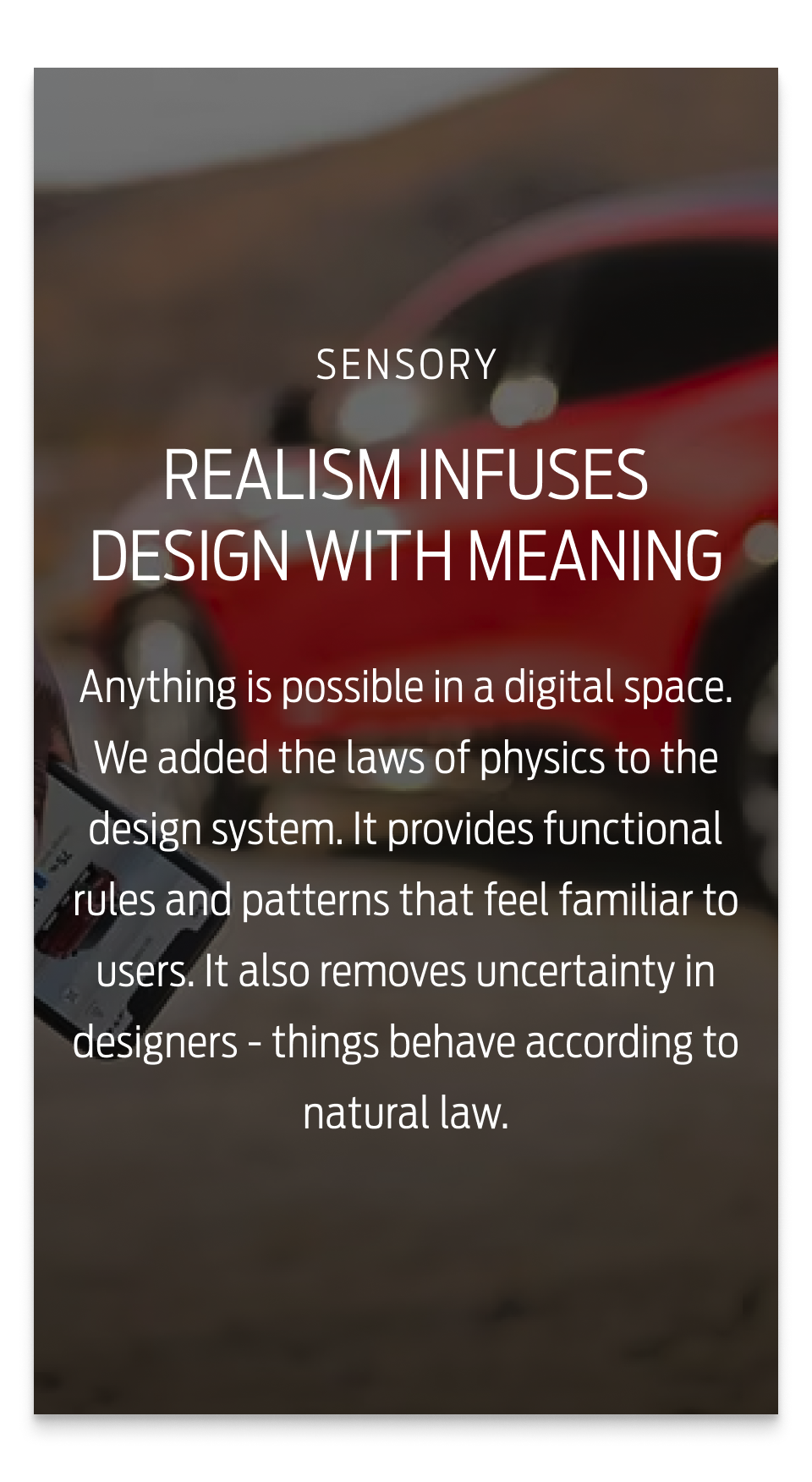
The surface lays beneath and holds together this environment. Freeing elements to almost float enabling a physical real world interaction feedback loop.

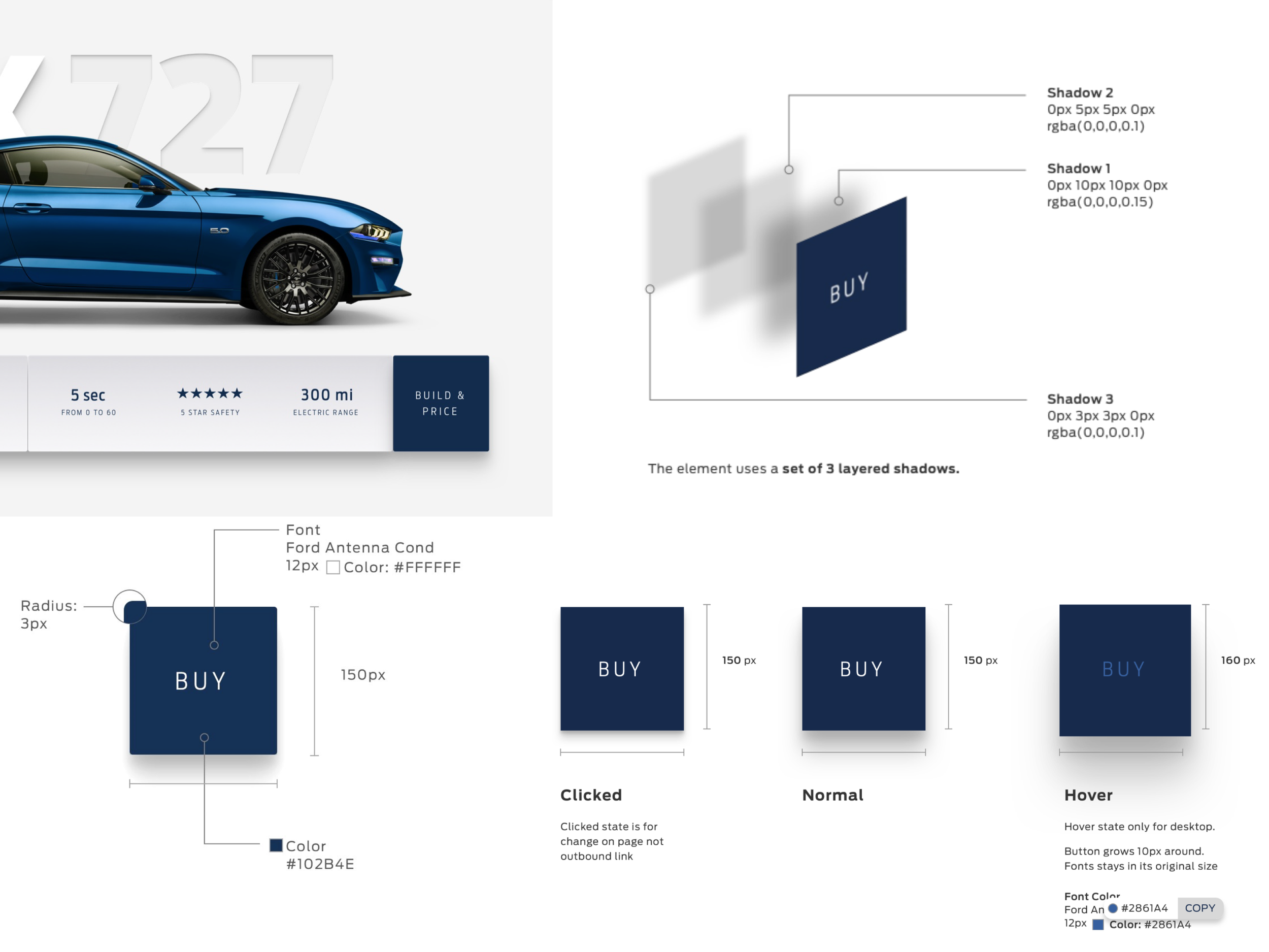
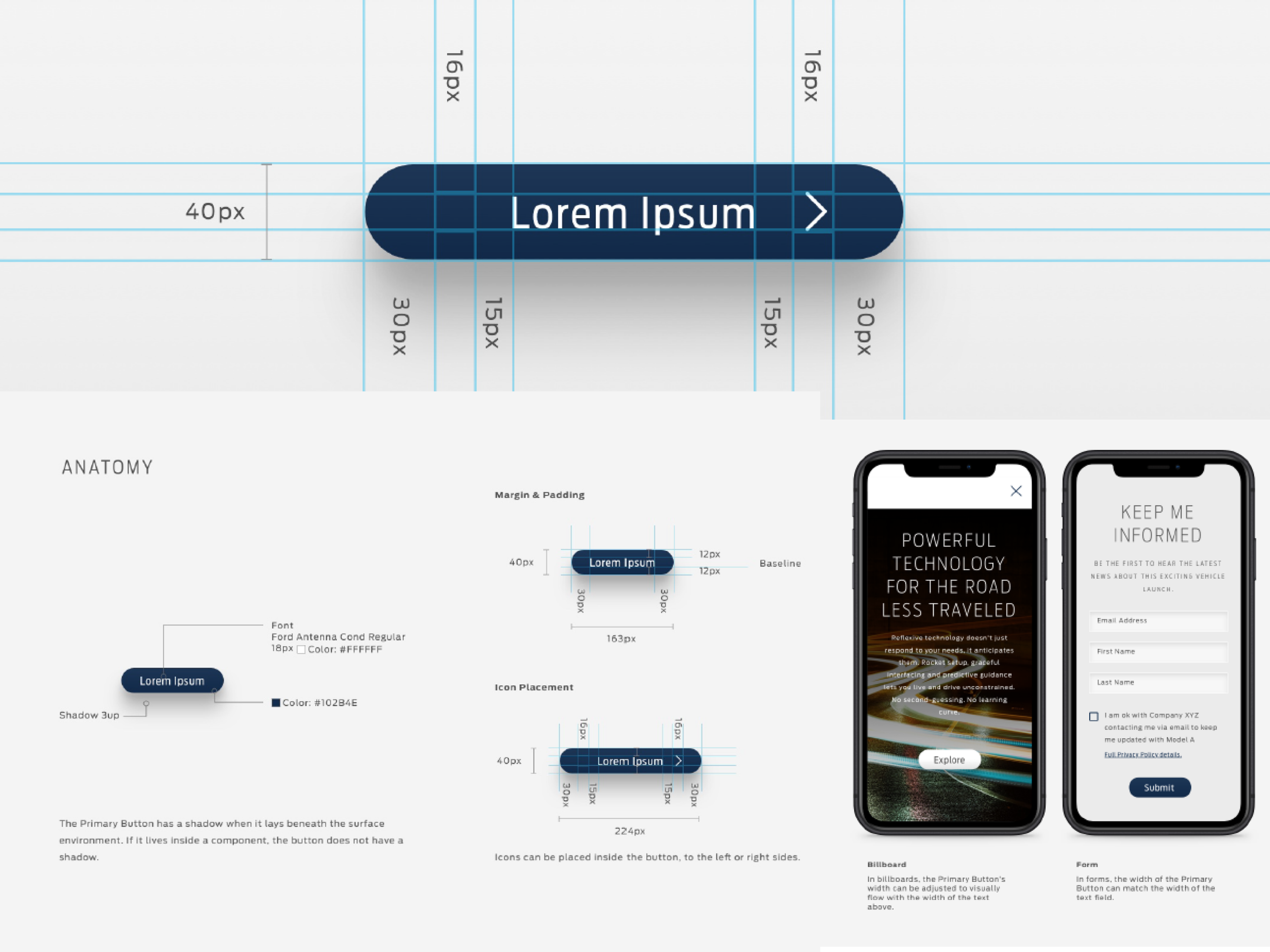
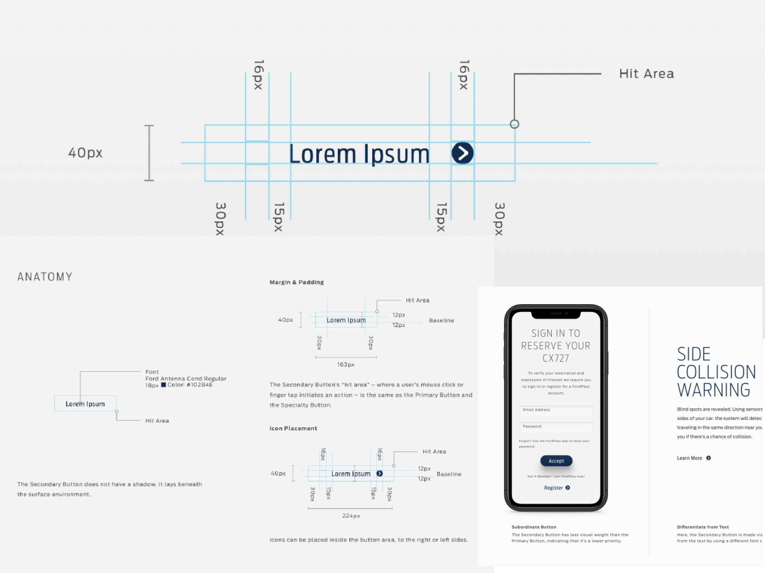
LAYERS
Using three levels of layers to prioritize and organize content. Our environment will energize with motions.
PHILOSOPHY
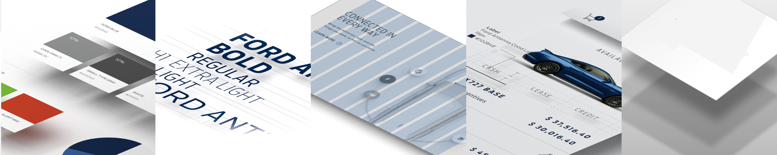
ELEMENTS
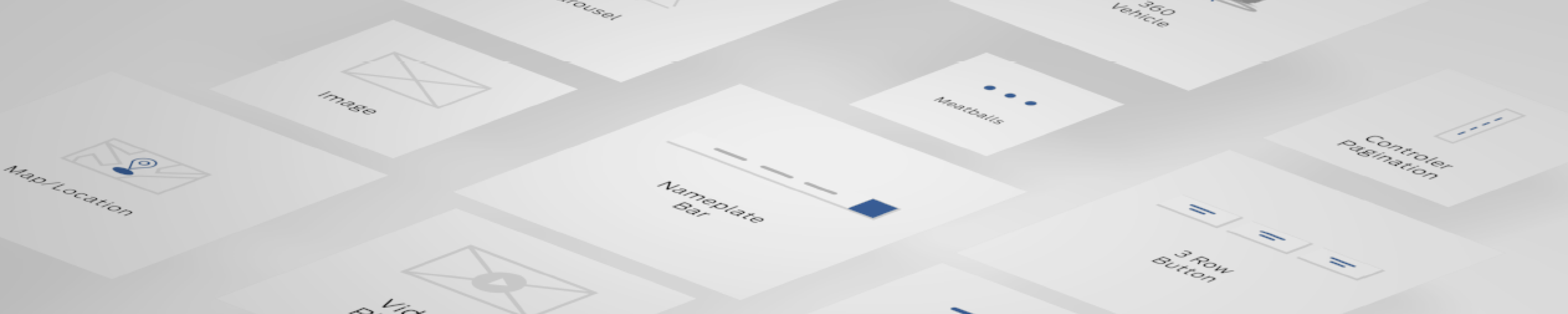
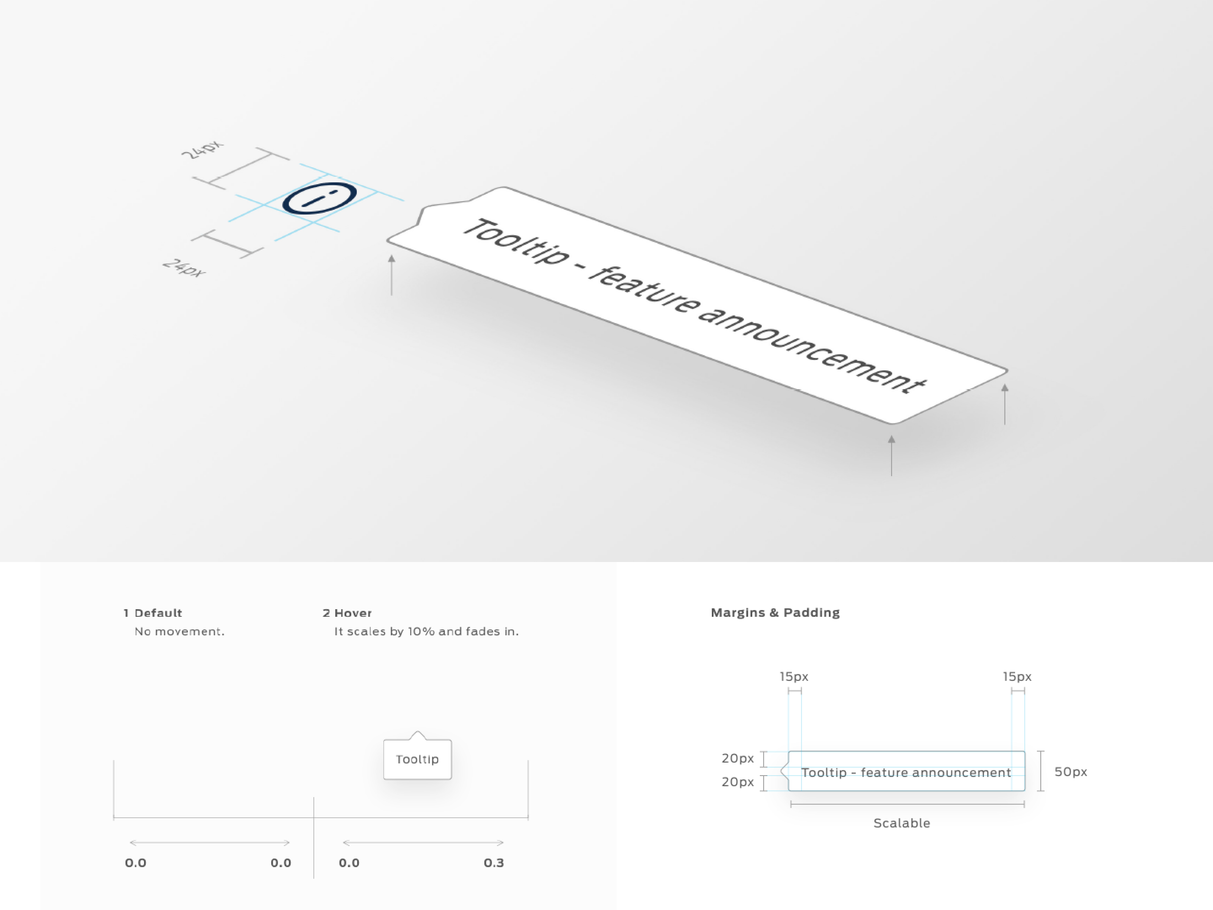
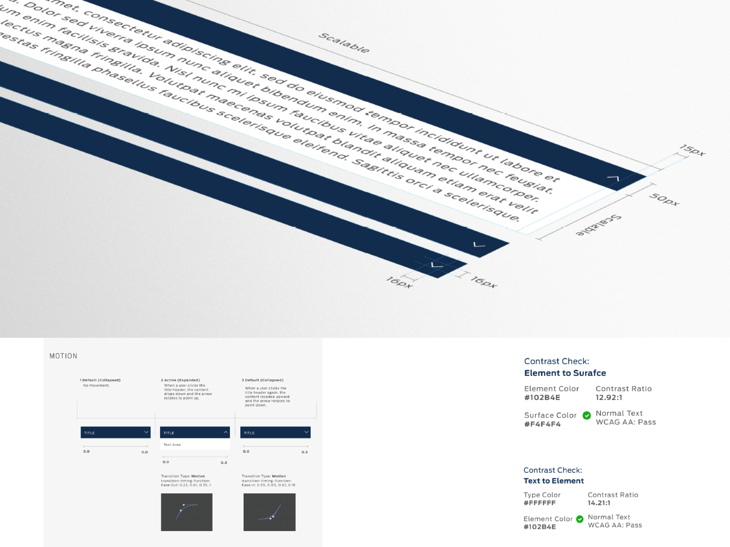
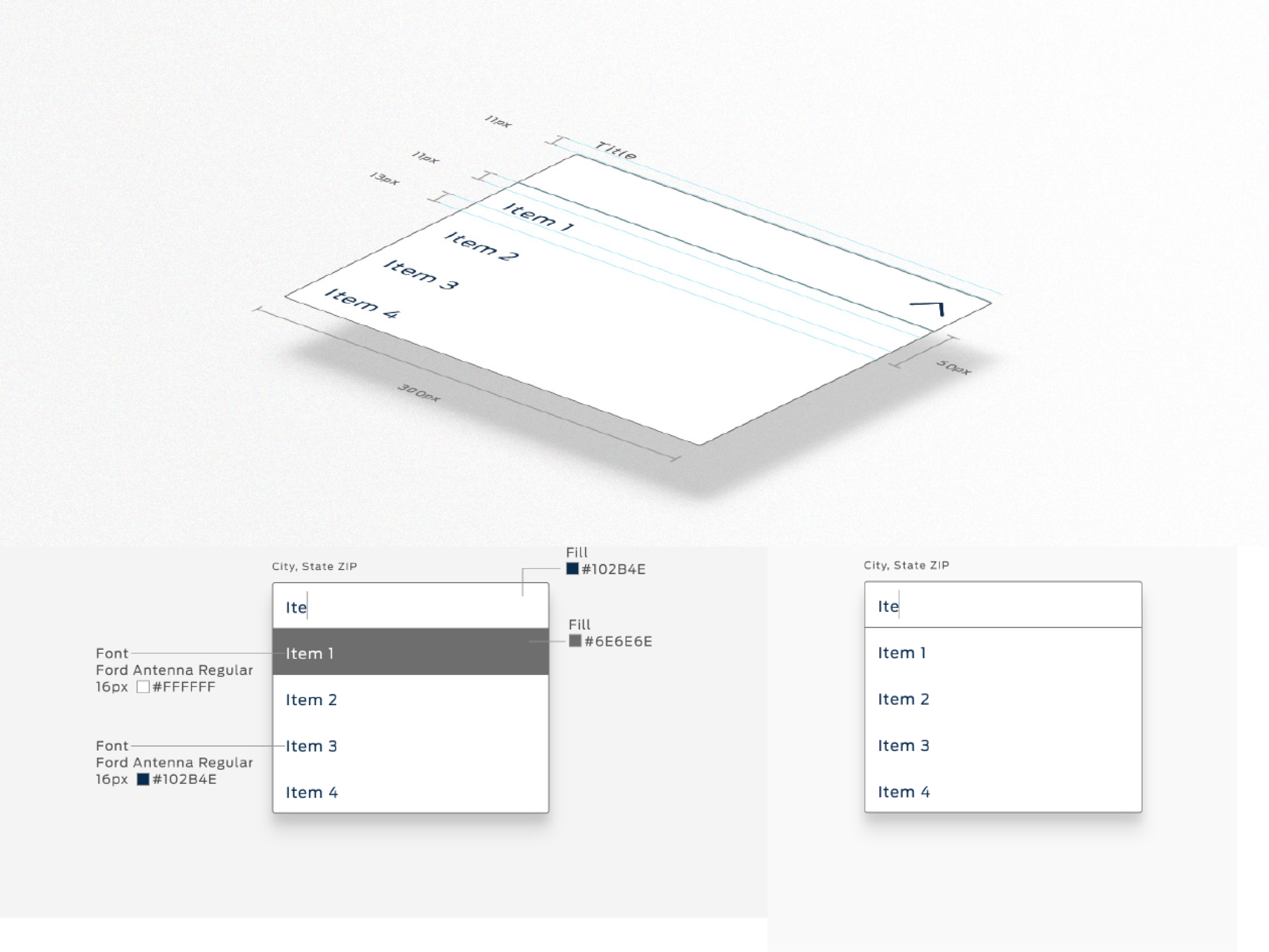
An element is the basic unit of the whole ecosystem.
A group of elements conform a component.
,
COMPONENTS

A composition of elements to build out globally scalable components
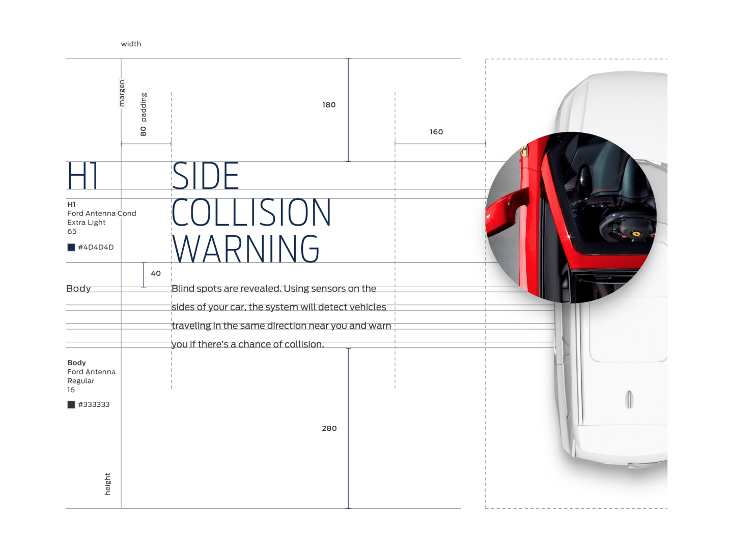
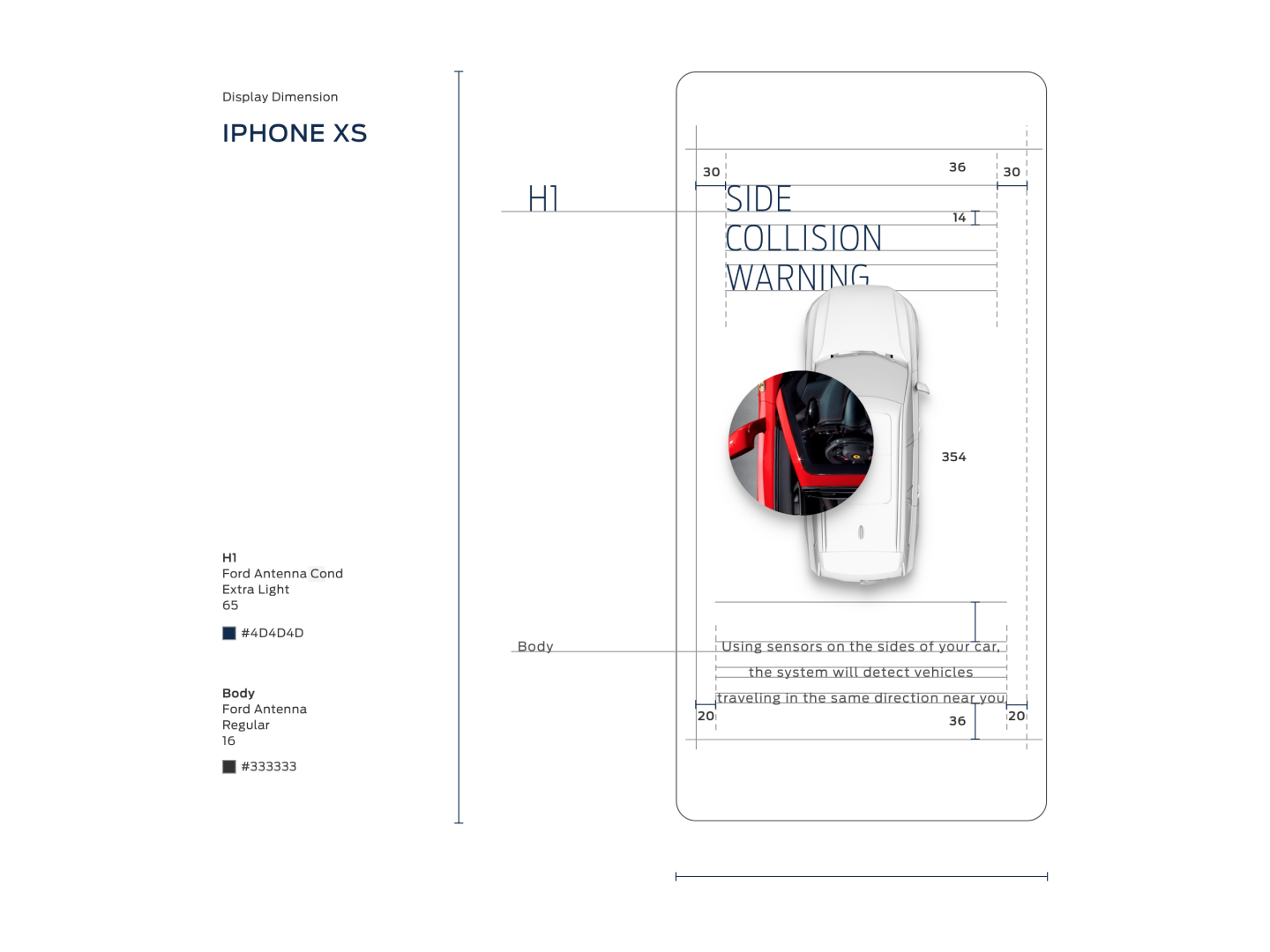
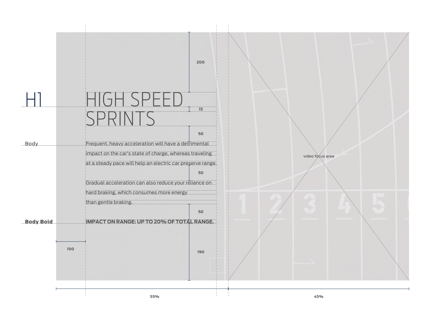
// TYPE TREATMENT
// CALLS TO ACTION
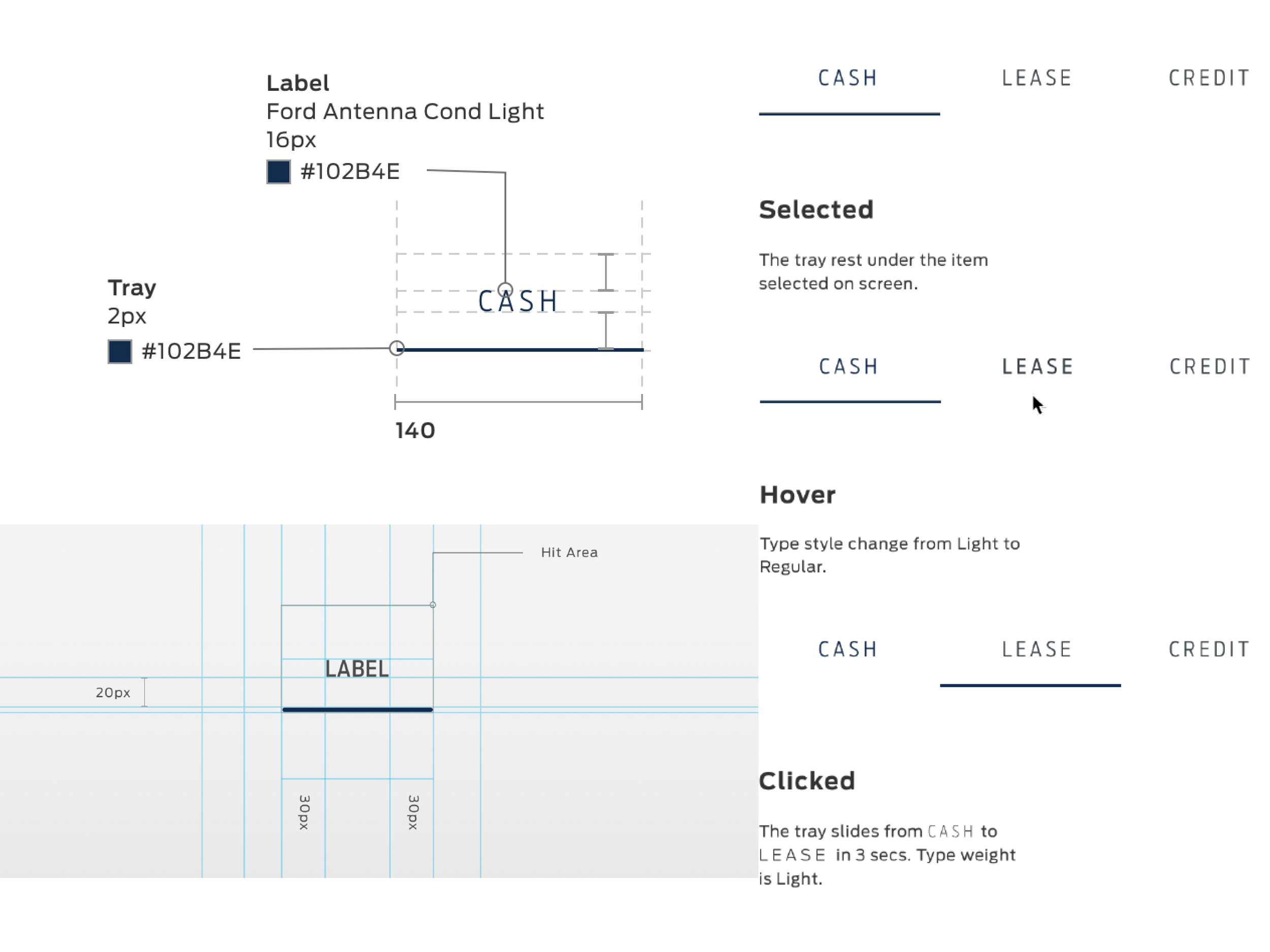
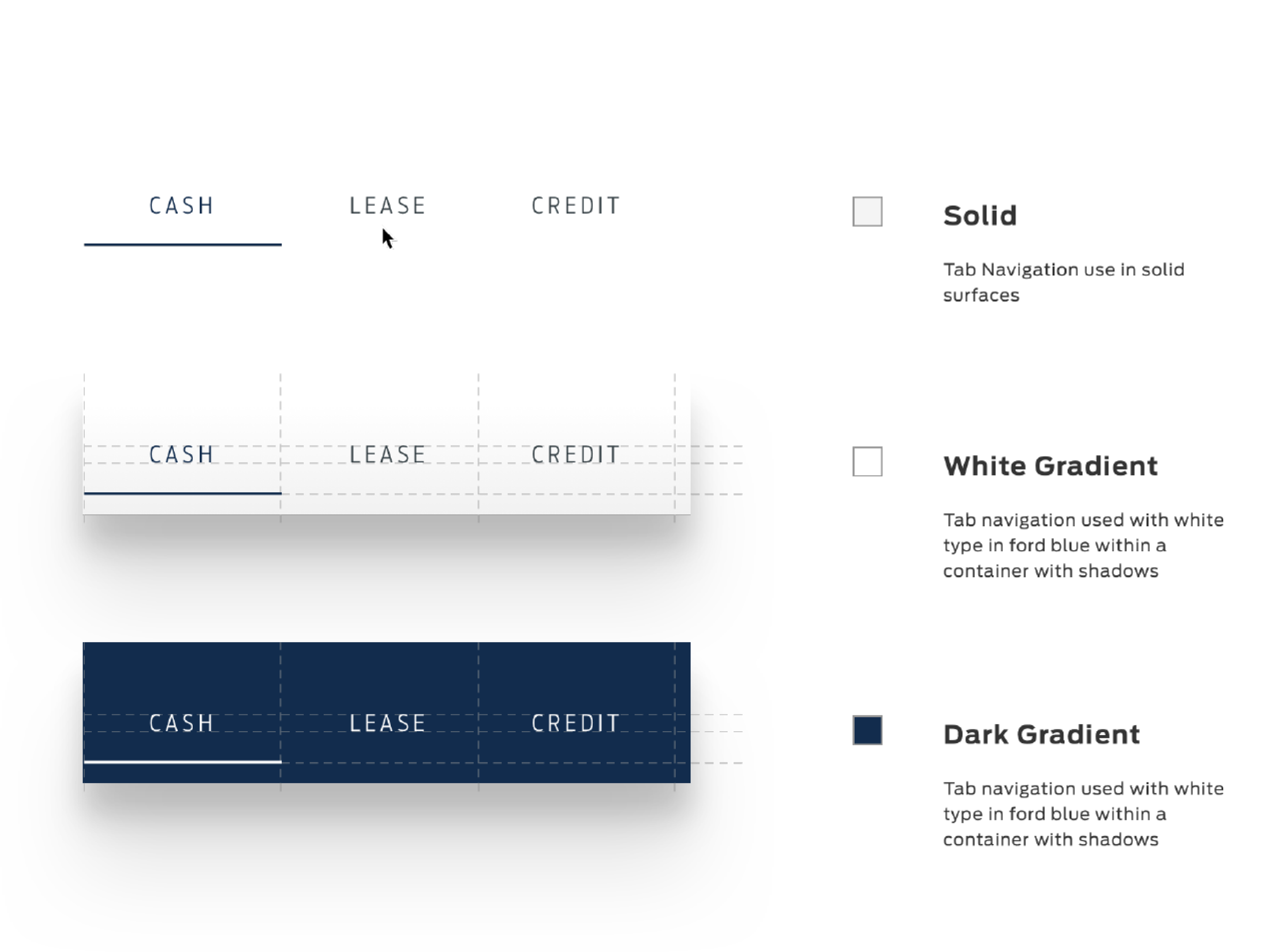
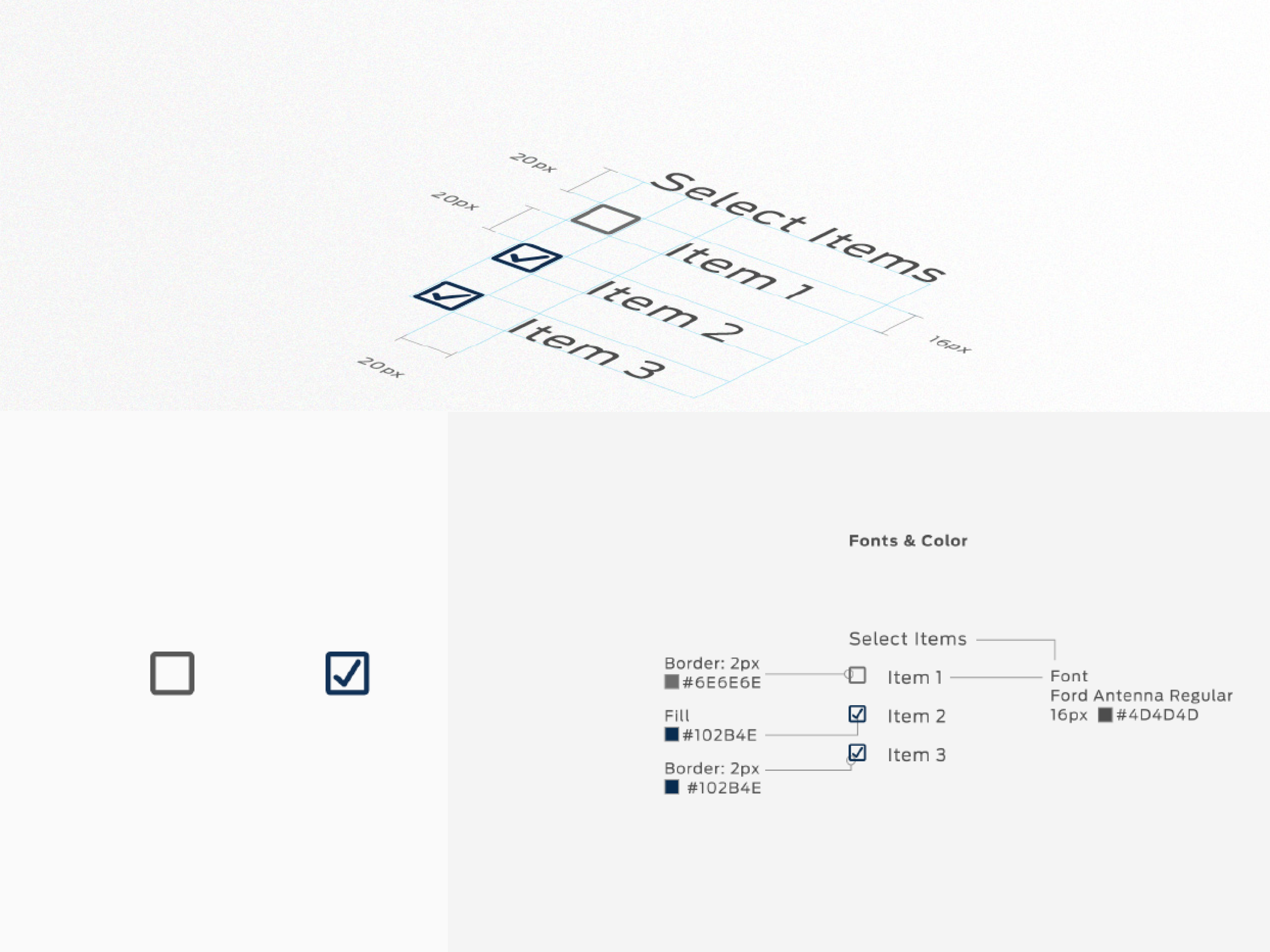
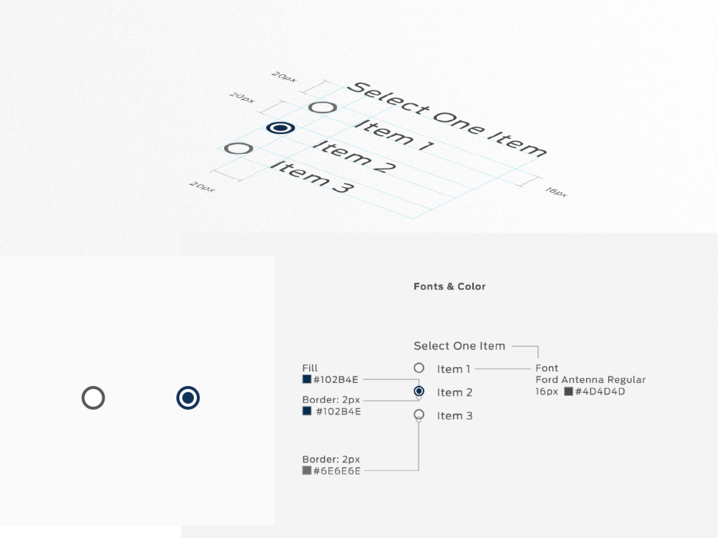
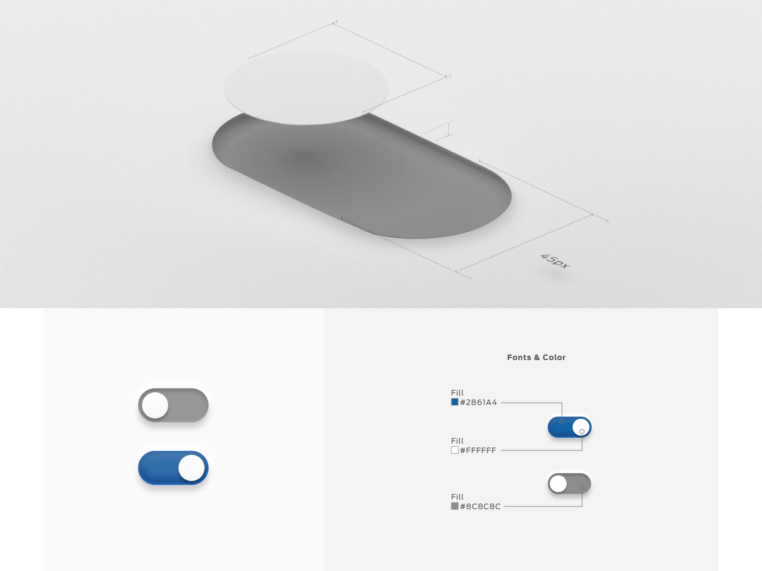
// SELECTORS

// DROPDOWNS
// INPUT FIELDS
// RADIO CARDS
// CONTENT CARDS
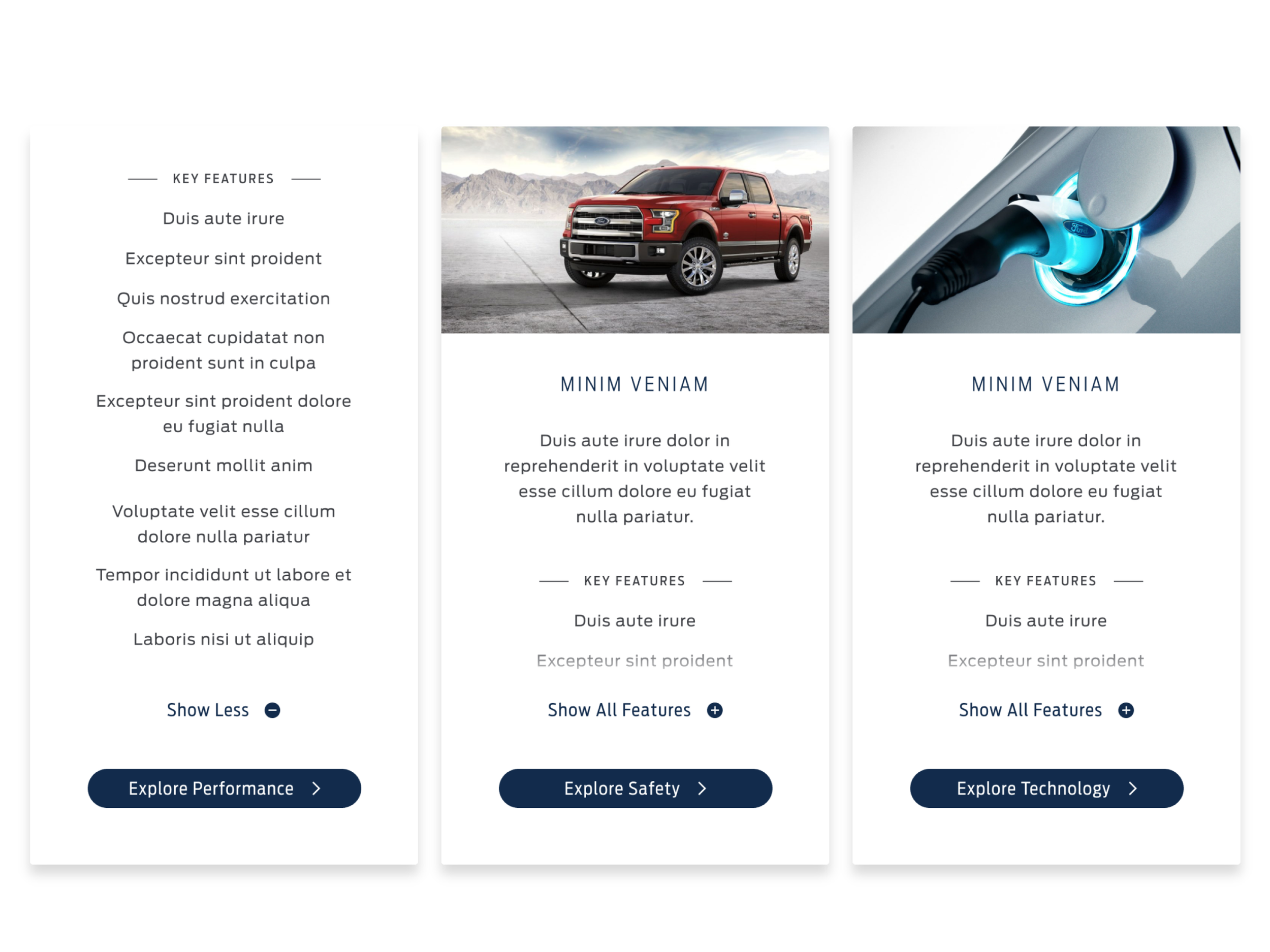
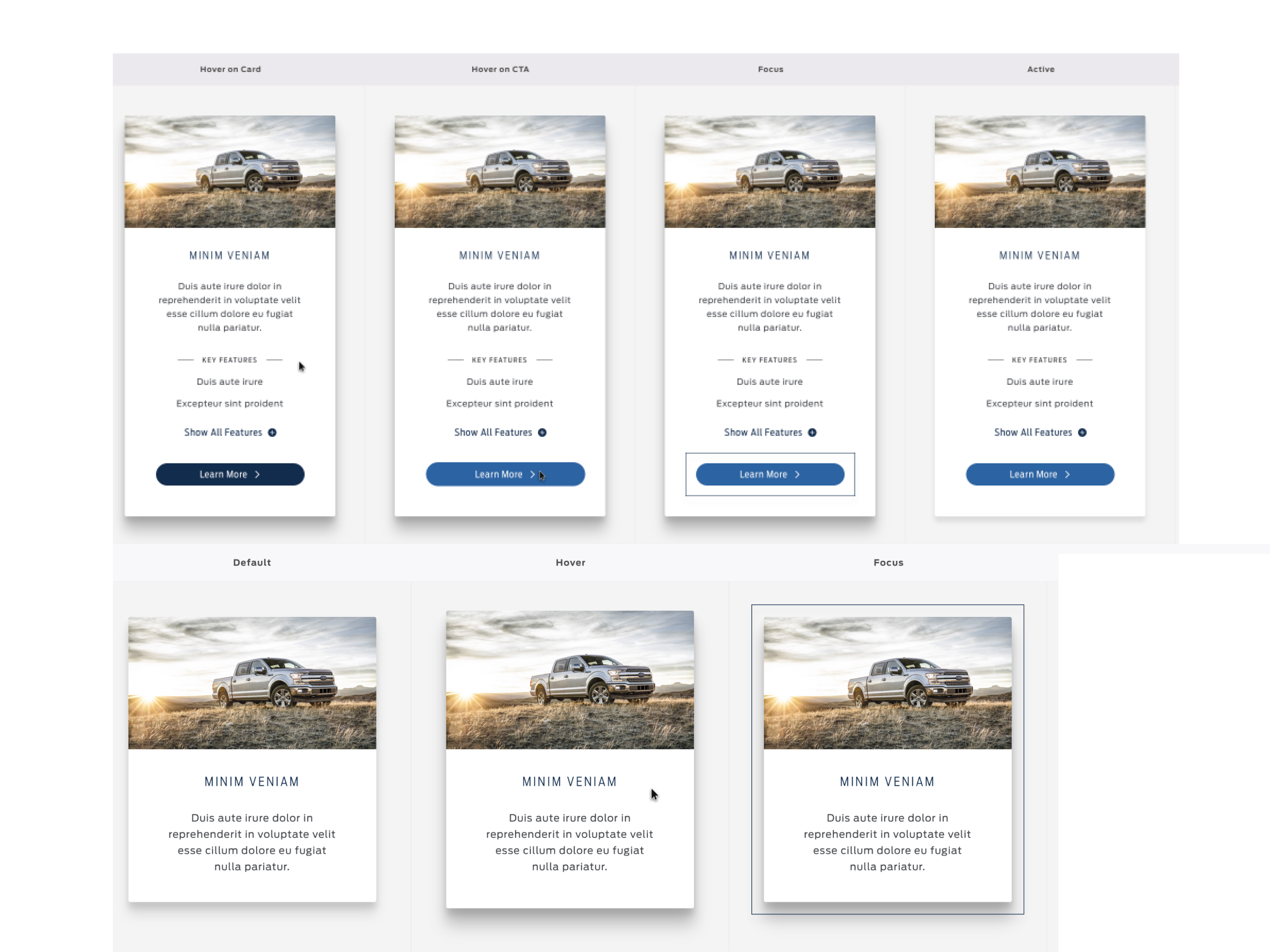
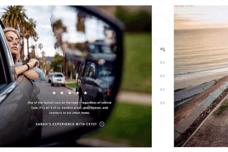
// BILLBOARDS
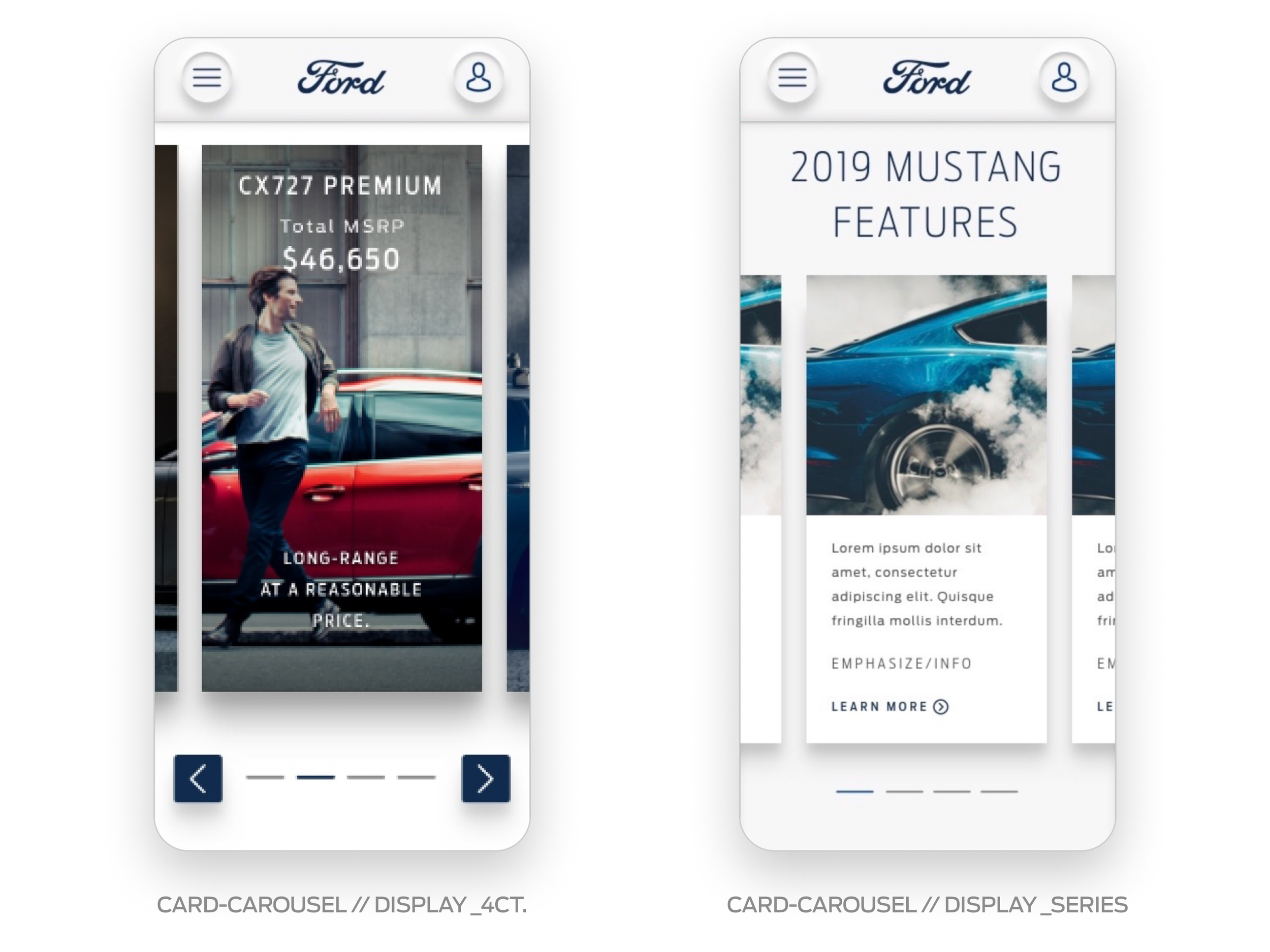
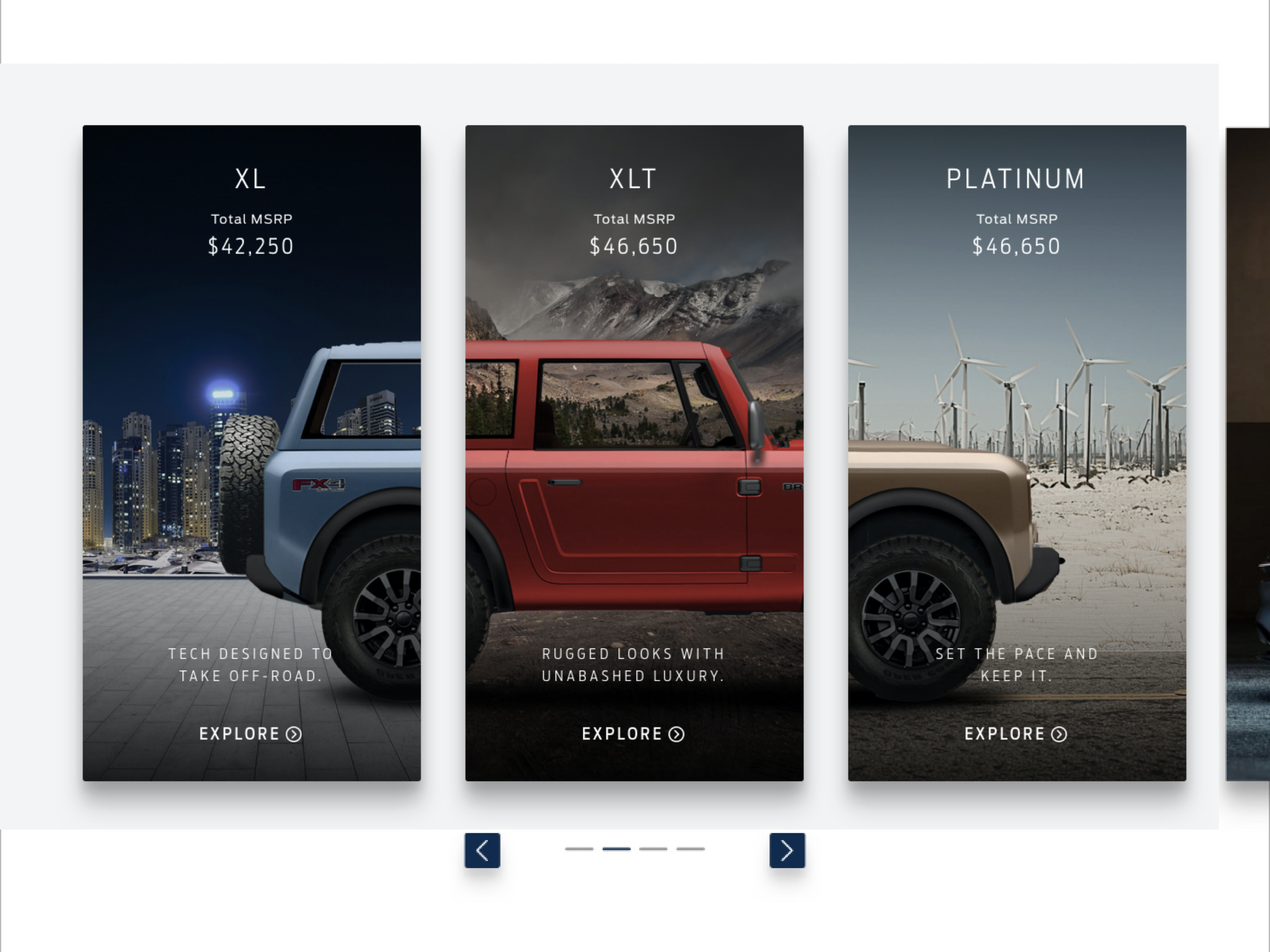
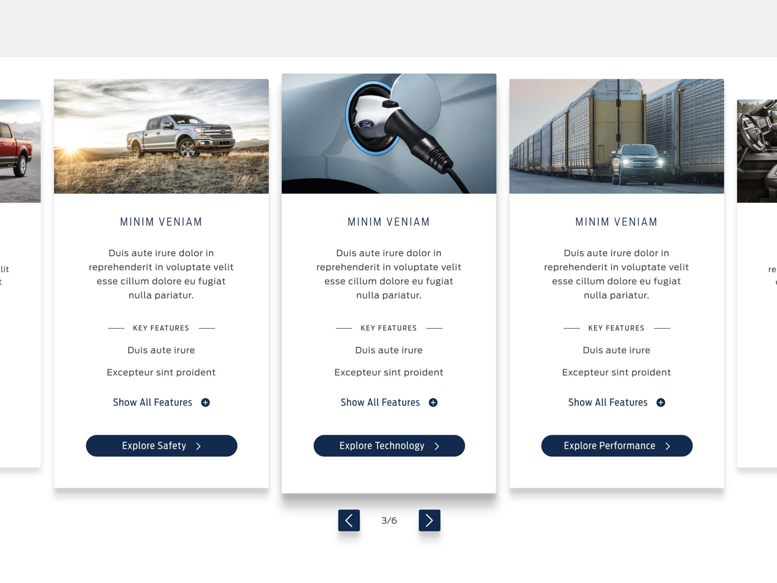
// CAROUSELS
TEMPLATES
Templates are created by a group of components to create pages. They serve as an evergreen space where beauty is expressed in an organized way, and user interaction can exist.

MUSTANG-CX727 LANDING
BATTERY ELECTRIC VEHICLE LANDING
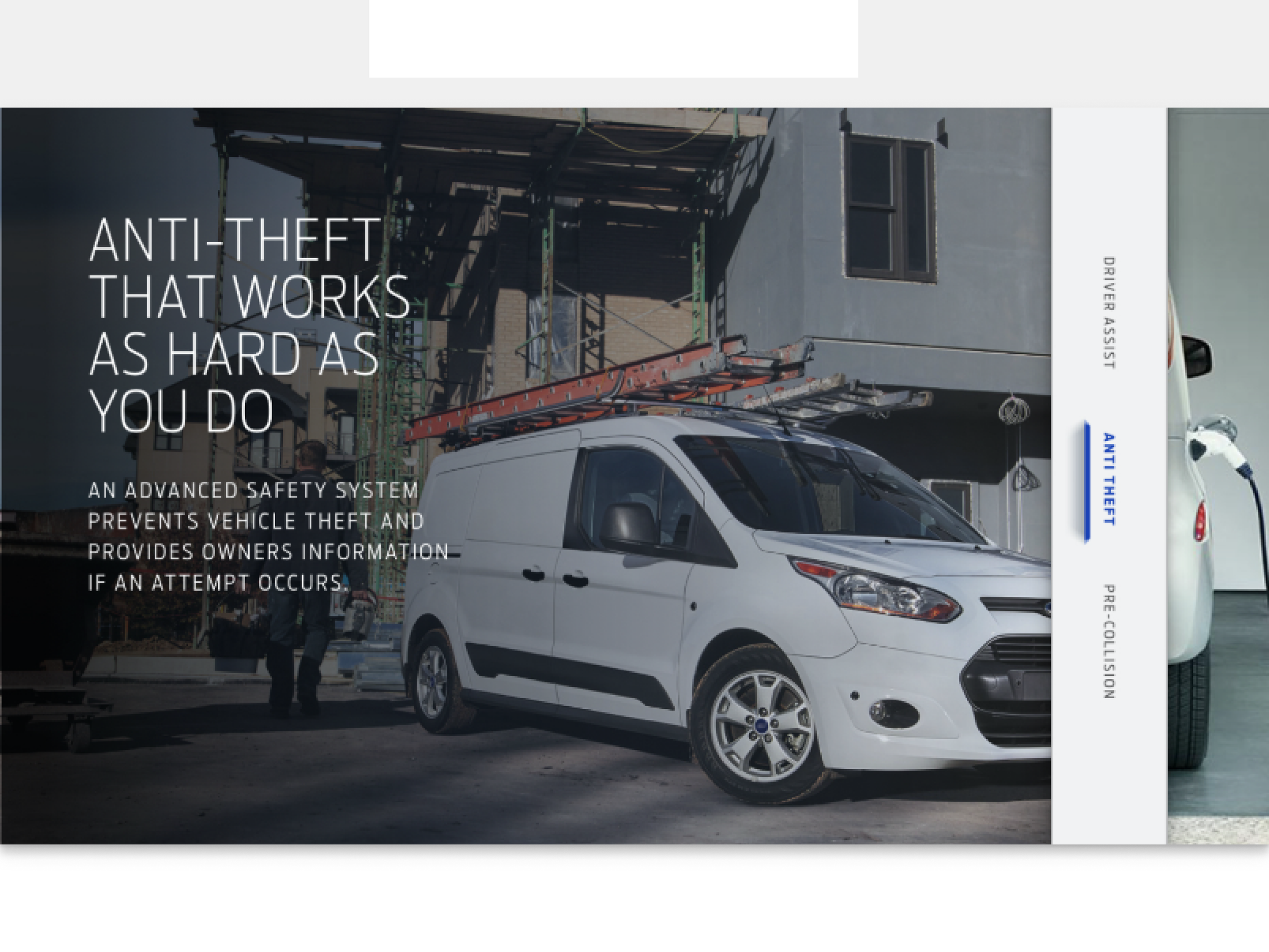
TECH FEATURES LANDING